
I like to work on personal projects every now and then. It forces me to learn something new. And sometimes, when I get started, the project seizes me and I just cannot rest until it’s done. I’ve recently worked on such a project. I made an interactive Star Wars data visualisation. Just to see if I could. And in this post, I’ll share five things I’ve learned while building the visualisation.
1: Apply existing knowledge to a new context
I’ve had some fun with sentiment analysis of music lyrics over the past two years. For this project I decided to apply sentiment analysis to a new context: movie dialogue. As it is easier to work on something you like, I picked one of my favourite movies: Star Wars Episode IV.
Changing the music context into a movie context introduced some interesting new questions. One of them was about the number of data points. When visualising the sentiment of songs on an album, the number of data points are limited. Most albums have 10 to 20 songs on them. When looking at dialogue lines from a movie, there are hundreds of data points. What works as a data visualisation for a music album, may not work for a movie.
Besides that, I thought visualising the sentiment of movie dialogue could show the movie in a whole new way.
2: Finding beauty in mistakes
I started out with slight tweak of scatter plots I’ve made before. I previously used the x-axis for the sentiment score and the y-axis for magnitude (or strength) of the sentiment. This time, I wanted to show how sentiment progresses over time. So I had to change the axis a bit.
While working on this visualisation, something interesting happened. I played around a bit with the y-axis values. I tried using both sentiment and magnitude individually, and a combination of the two. At some point during the development, I made a unintended but beautiful mistake. I used the sentiment score for the value of the y-axis. But I accidentally left the scale of the y-axis set to a different value, to the maximum of the magnitude.
Why was this a beautiful mistake? Well, it compressed the data points. It pulled all the dots to the centre of the plot. The result was a galaxy-like plot and very Star Wars. I also thought it would be nice to use the movie’s aspect ratio and I set the plot to a 21:9 ratio early on in the project.
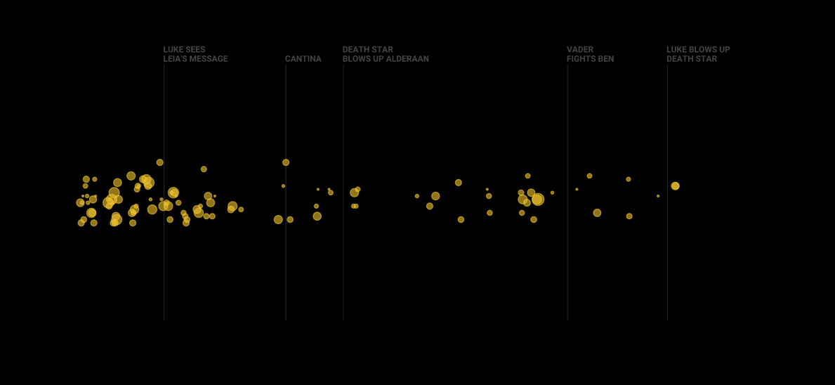
Here’s an example of one of my first plots I did for all the lines of C3PO:

At this point I had a new idea. Wouldn’t it be nice to try and make this thing interactive? A nice web-based interactive galaxy plot. One that allows you to turn dialogue on and off per character. Maybe add a few other interactions.
3: Solve your problem by not working on the problem
In the next phase of my project, I tried a few things to make the plot interactive. And at first, it was quite a struggle. I make most of my plots using the Matplotlib package in Python. The file type was set early on. I needed an SVG to make it interactive. But it turns out exporting a data visualisation for flexible use on a website is not that easy.
The main problem here is to connect some sort of identifier to each data point. A way to let the website know what meta data belongs to it (in this case the name of the character, line of dialogue, and sentiment data). My first try was a smart idea. It was also stupid in hindsight. I tried to infer the character from the colour of a dot. Now this worked quite well. But how would I get the corresponding sentiment data of each data point? Colour doesn’t tell me anything. Maybe I could infer it from the position on the plot? And the size of a dot? And what about the dialogue? How was I supposed to get that… I tried a few things, but things did not look too bright.
So I got frustrated. I took a walk and tried not to think about my project for a bit. And then, after about 15 minutes: pop! The perfect solution.
I generate my visual from Python. I have access to all the data in Python. So why not use Python go generate some data object for interactivity? And I did just that. I generated a JSON data object, loaded it into my website (using JavaScript), et voila: I had a perfect data object to go with each dot in the plot. Why didn’t I think of this before?!
Somehow my unconsciousness worked on the issue and solved it. In other words: not working on your problem is a really good way to work on your problem.
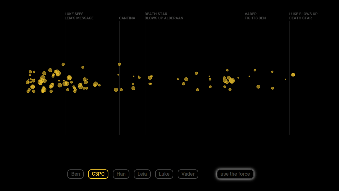
The solution allowed me to add some cool interactivity:
- Filter the dots per character.
- Click on a dot to show the line of dialogue behind it.
- Expand the space between dots to make it easier to select one.
4: Share your ideas early
With my first version of the interactive visualisation ready, I decided to give it an early viewing. I joined a small virtual data visualisation meetup where people discuss their work. I showed my Star Wars visualisation and got some valuable feedback.
One of the things I was struggling with was how to make the plot easier to understand. The main issue was showing the progress of time. I didn’t feel like adding any axis. It would make it look to graph-like for me. Luckily, the people in the meetup group had a great idea: show time by highlighting some important moments in the movie.
And so I picked some important moments and added them to my plot:
5: Have fun
My final and maybe most important point is about fun. What good would a Star Wars data visualisation be without some fun? Without some subtle Star Wars touches? One of my interactions is a good example of this.
I have a button to expand the space between dots. It makes it easier to select a dot and see the dialogue behind it. Now I could have labelled the button ‘expand’, but that would be boring. How does a Star Wars character, and more specifically a Jedi, move something? If you are a fan, you already know the answer:
I also had some fun writhing the copy that goes with the interactive data visualisation.
Using the force
When I get hooked to the idea of a new project, I feel like some external force is pushing my development onwards. It is a force that drives you to learn new skill. It is a beautiful state to be in. It often fires new ideas into my head: Should I add more features (e.g. other episodes)? Should I make it mobile friendly?
For now, I am satisfied with my result.
If you want to give the interactive Star Wars data visualisation a try, you can do so here.