
Somewhere in 2019 I decided to open up my data art project. Since then, I’ve focused on sharing the technology using blog posts, a GitHub repository, by giving talks and workshops. One of the joys of sharing your projects with other people, is that you never know how people end up using it.
A cubist view
I started giving workshops based on the project in 2021. It is through these workshop that I found the inspiration to add a new visualisation to my project.
I get excited when it’s a workshop-day. I get a chance to share my knowledge with new group of people and to learn from them. As every person has a unique background, I never know what the day will bring. During these workshops, the students sometimes come up with some really nice, abstract graphics. And some of them made me think of cubist paintings. Let me share two of them with you.

This visual was generated by character lines in a movie scene. The student was looking for a mountainous landscape that fit the scene, and came up with this nice abstract landscape image.
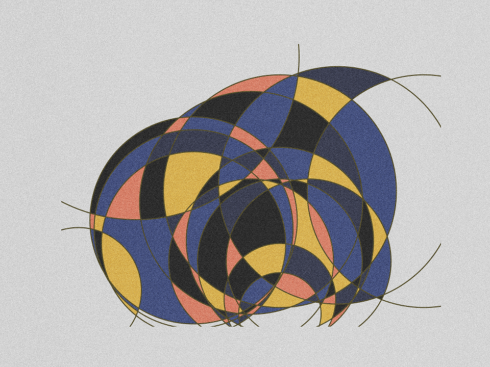
This one was generated using the lyrics of a music album. It has both a cubist as a stained glass feeling to it.
A new cubist data art asset
I liked the way both of these graphics are based on a large number of coloured patches. A while ago, I had the idea of making a plot that combined each data point to every other data point. My Dagny visual was made with this approach, but that one was made by hand. It was also fairly easy to do, with just 5 data points. But the number of lines vastly increase with more data points. For Avicii’s TIM, with 12 songs, I would need to draw 132 unique lines. It’s doable by hand, but not very fun. So I wrote a new script that would generate this web of 132 lines automatically:

This visual can be a starting point for a cubist visualisation of an image. In the example below, I use the picture on the album cover of TIM. Using a colour picker, I fill out each patch with a colour from the corresponding section of the cover.
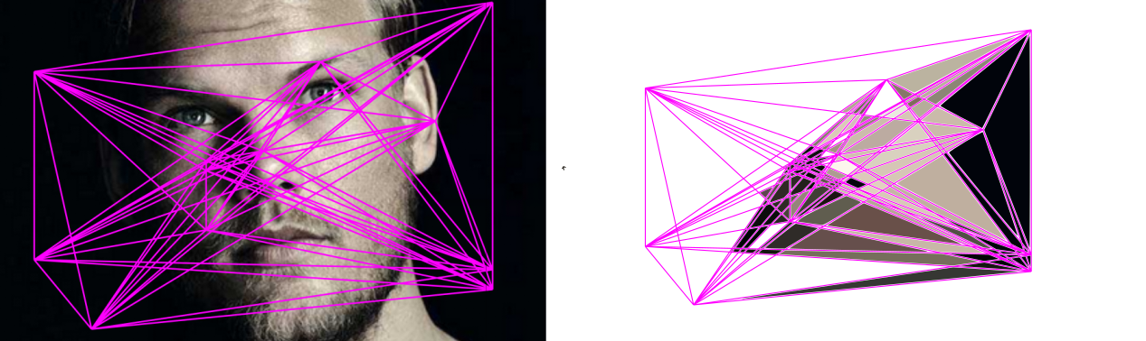
Image cut from the cover art of TIM. Copyright belongs to the label (Universal) or the graphic artist(s).
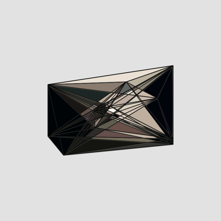
It’s interesting that Inkscape (the illustration tool I use) tends to leave a white margin between the shape outline and filled out patch. This also changes a bit based on the zoom-level I’m at. But I like it as an artistic effect.
After some manual fill work, I ended up with this result:
I think it’s a pretty fun new way to visualise data. And a good example of how technology can be a good friend if you want to be creative.
I consider automating the last step of process, colouring the patches, but I’ll save that work for another time.
Automation update
Okay. I’ve gave a few tries to automating this setup. The idea I have is to use a python package that allows me to overlay the shapes over an image. After that, I grab the average colour of the image area the shape is in. When I have the average colours, I generate a new plot of the shapes using those colours. It turns out that the opencv-python package gives me what I need.
Here are a few work in progress images of the first tries of cubism automation. First one with a solid fill:

After that, I used a lower opacity: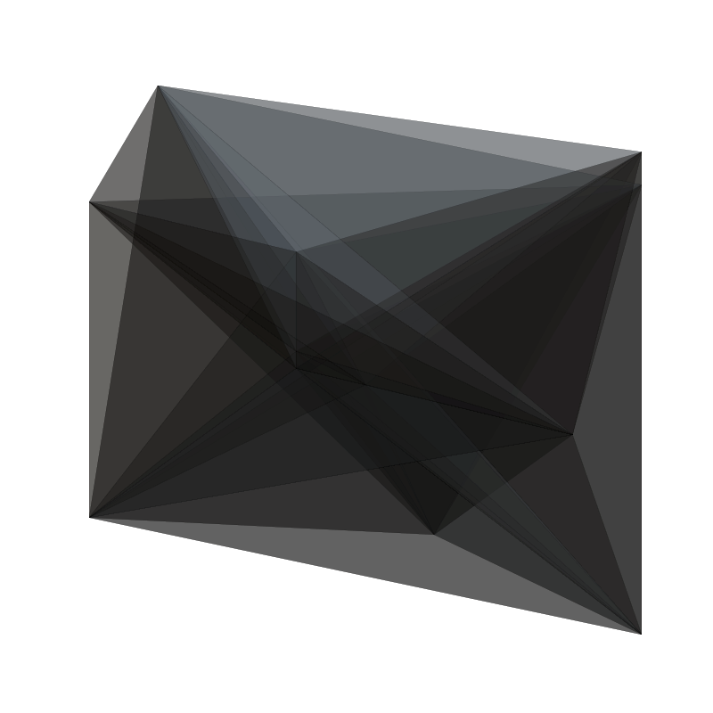
I’m not satisfied yet..
If you would like to give my data art project a try, you can find all the relevant information on the project page.