
Personal projects. I love working on them. They allow me to use any technology I like in any way I like. They can lead to interesting and sometimes unintended results. And I always learn something by working on them.
In this post, I try to explain how I approach personal projects, from the ideation phase to creation. As an example, I use a recent interactive visualisation I made about the book series Three Body Problem (2016-2010, Liu Cixin).
You can view the project here or view the preview image below.
1: Ideate & chill
This first part is a bit philosophical. It’s about how I think new ideas pop up in my head. On a theoretical level, I was influenced by two books.
The first one is Understanding Media: The Extension of Man (McLuhan, 1964). The book discusses how any medium that we use, is an extension of something we do. A hammer is an extension of our arm and muscle power. It allows us to put nails in wood more effectively, thus reducing the need for pure muscle power.
The second one is The Shallows: What The Internet is Doing To Our Brains (Carr, 2010). You could see this as an appendix to McLuhan’s book that discusses the internet as a medium. I was especially intrigued by how the internet is a highly networked medium and how it feels designed to distract us.
After reading these books, I started wondering: just as hammer reduces our need for muscle power, could the networked nature of the internet reduce our own networking capabilities? Would it make me less effective in linking ideas?
Ever since I reduced the time I spend on online and social/networked media, and spend more time on non-networked media (e.g. books), I felt myself slowly become more creative (as in the literal meaning: wanting to create things). I’m not sure how this works, but it feels like I’m unconsciously trying to connect ideas to other ideas. Sometimes these connections make me want to make things.
My Three Body Problem project is a good example of this. When I was reading through the story, I experienced many links to other content I’ve read throughout the years. This collection of links somehow, somewhere linked to a Star Wars project I worked on that shows data in a galaxy-like scatterplot.
And then the idea came up: let’s present all this linked content as interactive galaxy map. It’s very fitting to the book, as it is scifi about space. And it is fitting to me, as I’m interested in space.
As soon as this happens, I’m satisfied. I’m a happy man. I let the idea exist in my mind for a while. As I was still reading and enjoying The Three Body Problem, I was in no rush to start working on the project.
2: Data collection
Okay. I did start working on the project when I thought of the idea. But only a little.
I started by making a list of the related books I was thinking of. I worked on the initial setup of this list of books, as the idea came to me about halfway through the story. Not doing it right away, might have had resulted in me forgetting some of the relations. After that, I added each book that popped up in my head as I read.
This data collection was nothing more than a list of book titles in plain text. The bare minimum I would need to start working on the project. And collecting this data was easiest do to when reading, as I experienced the links to other books in various sections of the story.
3: Design ideation
Before I started working on the project on my computer, I started thinking about the design. I had just completed Visualising Complexity (Hill & Lachenmeier, 2022), a handbook on information design. This made me think of ways to represent the information in my dataset.
As my project is about books that are related to The Three Body Problem, the design should convey information about this relations. During walks and runs, I came up with the various ways I planned to display the information in my dataset:
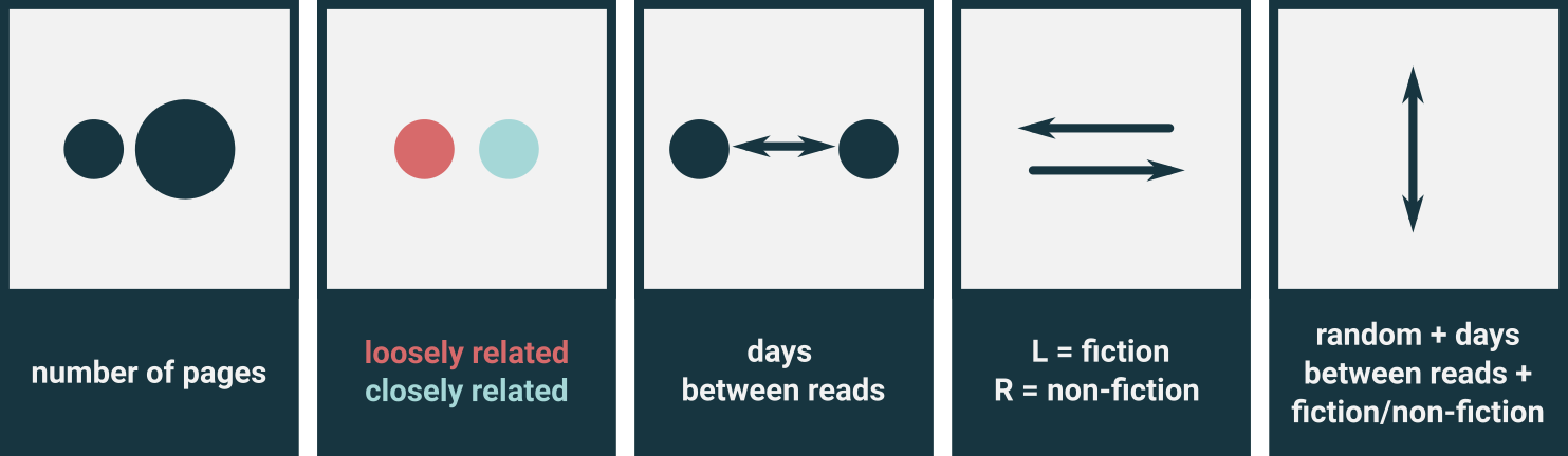
- Size: the size of the stars in my star map would be determined by the size of the book.
- Redshift/Blueshift: the colours of the light of stars shift to red when they are moving away from us, and blue when they are moving towards us. I would use this to display if a book is loosely related (redshift, moving away) or closely related (blueshift, getting closer).
- Distance from the Three Body Problem: the distance between the stars would be determined by the time past (in days) between reading The Three Body Problem and the related book (I could get this data from Goodreads). The three books of The Three Body Problem are displayed in the middle.
- Horizontal direction: related fiction books would go to the left of the Three Body Problem. Non-fiction would go to the right.
- Vertical direction: random, as we can’t predict everything and randomness might play a role in the universe.
Data visualisation info cards
The authors of Visualising Complexity share examples of data visualisations generated using their handbook. They include a type info cards that describe how data is mapped to certain visual elements.
It thought it would be fun to try and make info cards. So here are some that show my information mapping setup:
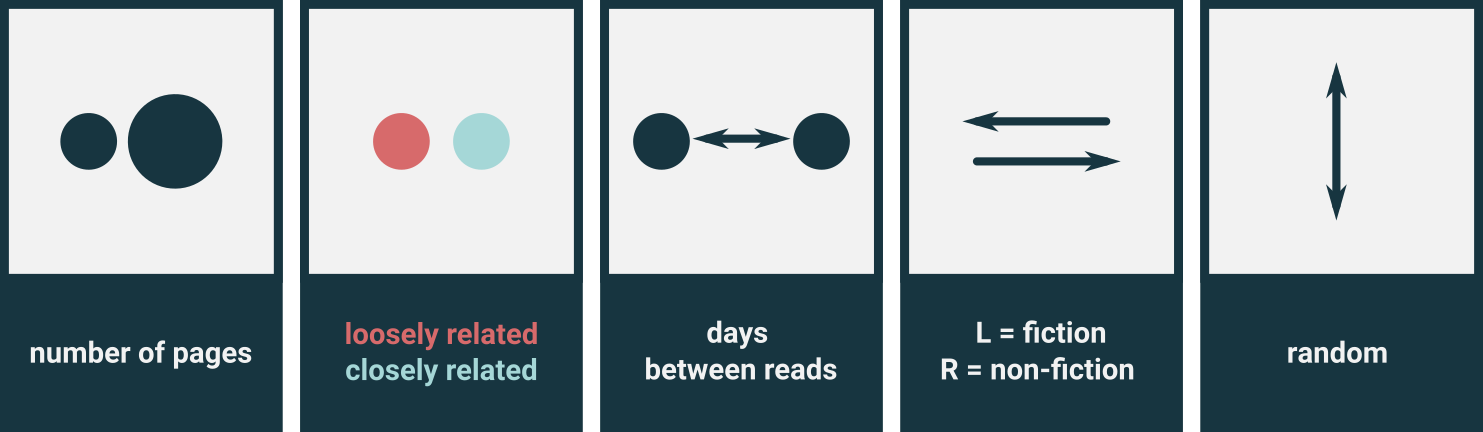
Side note: I made this when writing this post. Before that, the information mapping only existed in my head.
4: Enrich data (pt. 1)
When I finished the book, my dataset was limited to a list of book titles. Based on my design ideas, I started expanding my dataset. I set up a table in on of my favourite data tools (Excel) and started appending data:
- Book title (text)
- Fiction (True/Fralse)
- Date read (Date) (Source: Goodreads)
- Size (number of pages) (Source: Goodreads)
- Relation (L=Loosely connected/C=Closely connected)
- Notes (text, for now I filled this with a placeholder text. I planned to write details notes on how the book links to The Three Body Problem later.)
With the dataset ready, I was ready to start exploring the data.
5: Explore data
Jupyter Notebooks are the starting point for most of my data projects. If you are not familiar with these: these notebooks allow you to combine Python code and documentation in a single file. You could see it as a Word document that allows you to properly display code, run code and show the output of code.
Notebooks are awesome.
Using a notebook, I explored my data. My main goal here was to sketch the visualisation I had in mind and computed the extra values needed for that. For example, the distance between books is based on the number of days between reading that book and reading the last book of The Three Body Problem. This delta between two dates is calculated.
When working on my Star Wars project, I learned that a condensed scatter plot generates a galaxy-like feeling, so I aimed for a similar design. The visualisations in this phase don’t have to pretty, they just need to verify if my layout works.
Here’s an animation of some of the plots I made during this phase:
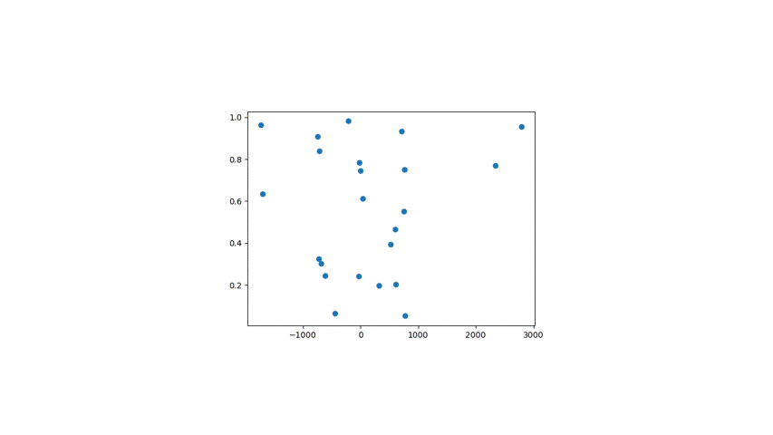
As you notice in this animation, I also experimented with a randomly generated background layer of smaller stars. These would not be interactive, but just serve as a backdrop for my main image. They should make the final product look more like a galaxy.
The plot below was the confirmation that my idea could work.
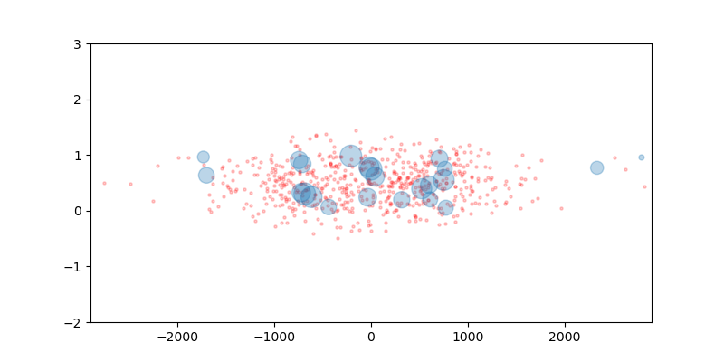
I felt comfortable enough with this result to start working on the prototype. As I wanted the star map to be interactive, I would make the final data visualisation using d3.js (JavaScript).
6: Data preparation for web
When working on web visualisations, you have various options to load the data. For example: you could load a CSV directly into your webpage and work with the data there. But I tend not do that.
As I have experience of working with data in Python, I find it easier to use that language to prepare my data for web use. Here are the steps I make when preparing data for web:
- Load the data in Python (using Pandas)
- Add new columns to the data (e.g. the time between reading two books)
- Transform the data to a web friendly format (e.g. JSON)
- Store the data in a .js file so my JavaScript code can use it directly.
This greatly reduces the need for data processing in JavaScript and allows me to focus on the visualisation and interactivity. If I experience something I’d like to change in my data, or some field I end up using in a different way than I intended, I consider adding that transformation in my Python code instead of my JavaScript code.
7: Product prototype
With the data explored and prepared for web, I began developing the interactive version of the visualisation of the galaxy map. Here I was helped by a book again! This time, it was D3.js for the impatient (Janert, 2019). I haven’t finished it yet. I’ll probably revisit my project code when I have.
During the development of the web version, I also played around with the vertical position of the stars. I was looking for a diagonal plot. To do so, I modified the way the y-position is determined. Instead of using just the random value for the vertical position, I tweaked it to be influenced by the horizontal value (distance) as well. I tried a few versions of this combination and reviewed the effects.
Updated info cards
Remember those info cards? Because I changed the way the vertical position is determined, I should update these as well.
This resulted in the following layout:
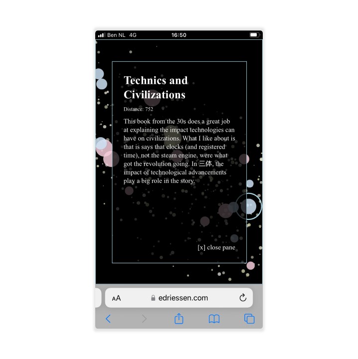
After that, I tweaked the design to make it work on mobile:
Ah yes, I like where this is going.
8: Enrich data (pt. 2)
With version 1 of the prototype ready, I was time to complete my dataset. I wrote the content for each book that appeared in my visualisation. For each one, I tried to focus on how it relates to The Three Body Problem. For some books, writing this content made me reconsider the relationship type (L or C) it had.
9: Product tweaks (ongoing)
I loaded the new data into my visualisation, to see how it would work. Besides that, I tweaked little aspects of the design (e.g. changing the glow of star and the colours of the backdrop stars).
Some texts included links, which did not show properly.
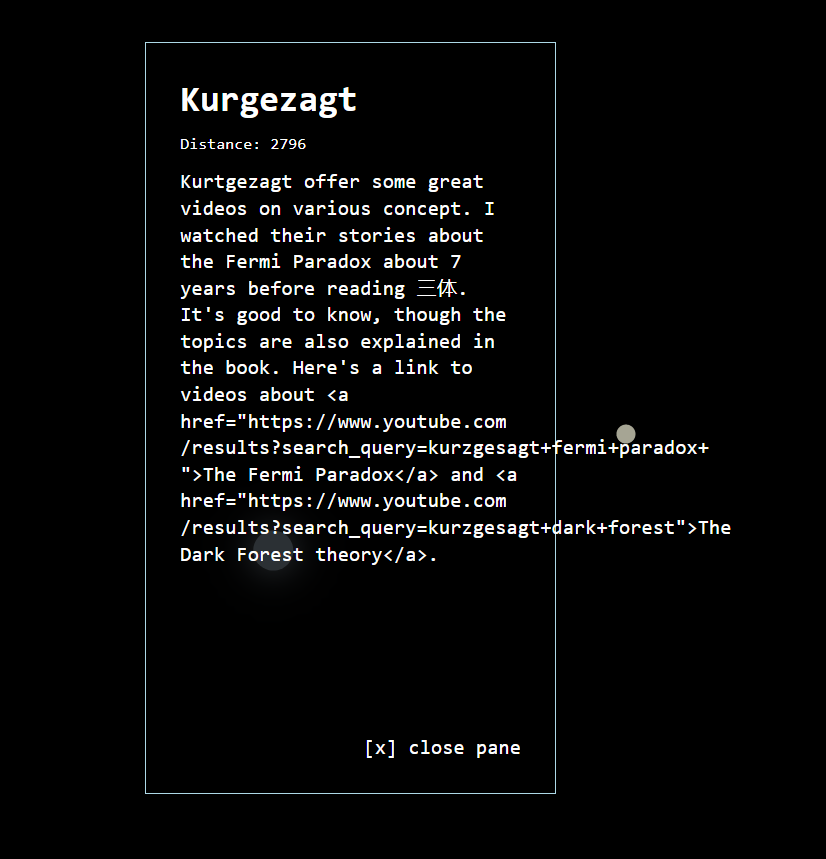
This is not hard to fix, but important to fix.
At this point in time, I felt comfortable enough to share the project. Although the design might change in the future based on new ideas by me or people I talk to.
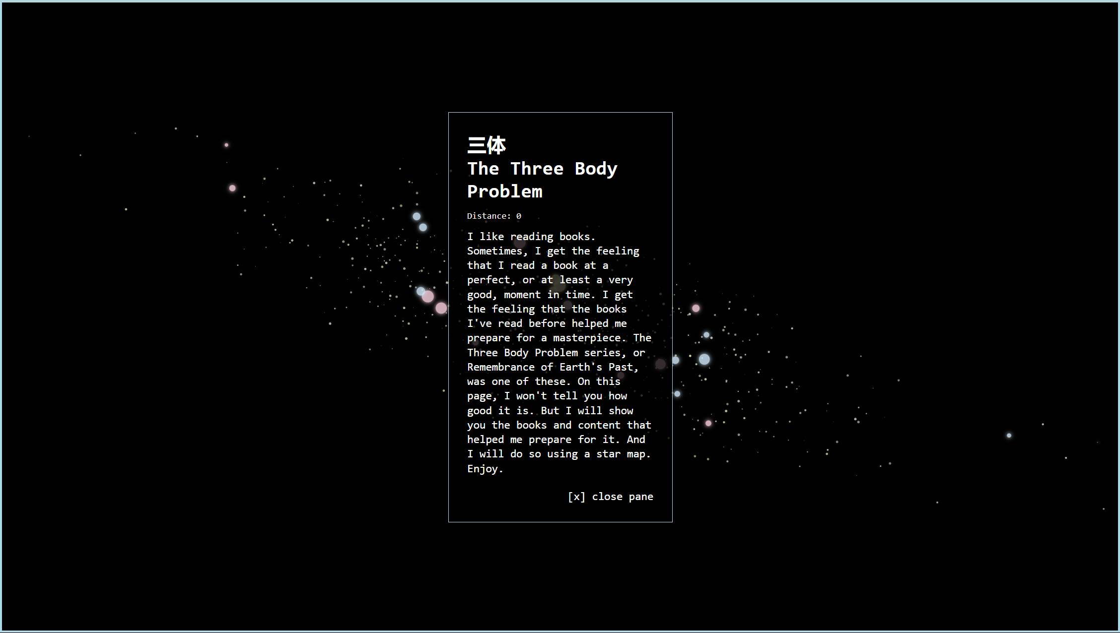
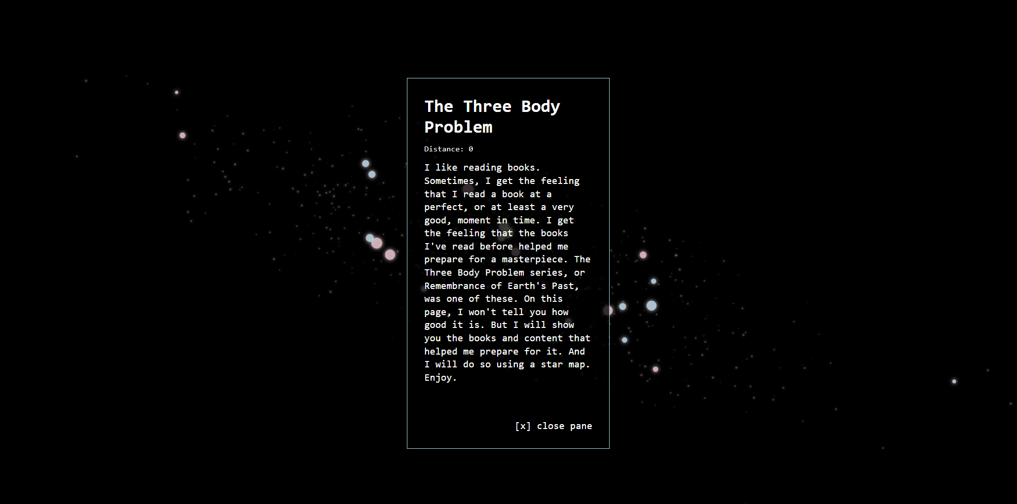
Here’s a link to the final product: www.edriessen.com/app/d3/three-body.
9: Document & Share
I like to spend time on knowledge sharing. I forces me to think about what I did, how I did it, and what other people can learn from it. In this case, I decided to write this piece on the process behind the visualisation.
I might also make Git repo for it at some point.
If you are interested in the timings of this project: it took about four weeks to go from ideation to completion (in its current state).
Alright. Thanks a lot for reading all the way through this post.
You are awesome.