
In this post, I’ll share an easy trick to generate custom colormaps to use in Matplotlib (my favourite data visualisation package for Python). The example I use in this post is the annotated heatmap example from matplotlib.org.
The standard heatmap
From the example code, this is the line that plots the heatmap:
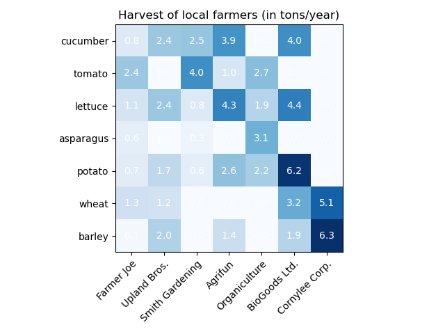
im = ax.imshow(harvest)
And it generates this heatmap:

Now let’s customise it.
Standard colormaps
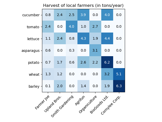
The easiest way to tweak the colours of a heatmap is by using one of the built-in colormaps (the options are neatly listed here). Personally, I prefer using single colour shades to show intensity in a heatmap. Using the built-in colormaps, we can change the code to have the heatmap use shades of blue:
im = ax.imshow(harvest, cmap='Blues')
And the updated result looks like this:
Now there is a clear readability issue here: the labels. The white font on a white background does not really work. The fix is easy: make the colour value for the annotations dynamic. You can do this in three steps:
- Store the max value of a series in a variable, e.g. harvest_max.
- Store the default colour value (w) in a variable, e.g. text_color.
- Check if the current annotation value is lower than 60% of the maximum value, if so, change it to the alternative colour, in this case black.
Here’s the modified annotation code from the example (updates in bold):
harvest_max = harvest.max()
for i in range(len(vegetables)):
    for j in range(len(farmers)):
        text_value = harvest[i, j]
        text_color = 'w'
        if text_value < harvest_max*.6:
            text_color = 'black'
        text = ax.text(j, i, harvest[i, j],
                       ha="center", va="center", color=text_color)
And the updated heatmap is nice and readable :
Custom colormaps
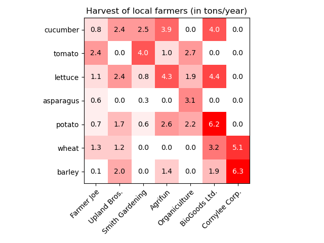
Now on to the good part. Even though Matplotlib offers quite some options for colormaps, sometimes you just need a custom one, e.g. when you need to stick to style guide. There’s an easy way to generate a single colour heatmap by using the alpha attribute of the colours.
Let’s say our base colour is red (#ff0000). You can append a range of hex values (00 to ff) to the colour, setting up the shades from 100% transparent to 0% transparent in 16 steps.
Here’s what that setup looks like in Python:
from matplotlib.colors import ListedColormap, LinearSegmentedColormap

base_color = '#ff0000'
color_shades = ['0', '1', '2', '3', '4', '5', '6', '7', '8', '9', 'a', 'b', 'c', 'd', 'e', 'f']
cmap_colors = []

for color_shade in color_shades:
    cmap_colors.append(base_color+color_shade+color_shade)

custom_cmap= ListedColormap(cmap_colors)

im = ax.imshow(harvest, cmap=custom_cmap)
Using a basic for loop, this generates 16 shades of the base colour (#ff000000, #ff000011, #ff000022, etc.). Here’s an image of the resulting plot:
Now all you have to do is modify the base_color variable into some fancy looking colour (let’s say it’s #D9936A) and you have a style guide-ready heatmap:

I hope this trick helps. Have fun generating some custom coloured heatmaps in Matplotlib!
Cover photo by Tony Sebastian on Unsplash.