
Earlier this year, I shared a personal project. With the project, I showed how I used a service by Google (the Google Cloud Natural Language API) to analyse the emotion (or sentiment) in music lyrics. In this post, I use the same technology to visualise his posthumous album TIM in a unique way.
If you haven’t read about my previous analysis of Avicii’s songs, you can read it here.
The sentiment
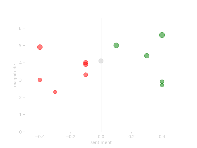
I started out with a visual representation of the sentiment of his songs; using red for negative songs, grey for neutral songs, and green for positive songs. This resulted in the following overview of the album:
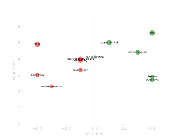
One of the upgrades I’ve made recently is a version of the plot that adds the song title to each dot. It makes it easy to find a song in the plot. Here’s what it looks like:
According to the analysis, the album has 6 negative songs, 1 neutral (which is interestingly called bad reputation), and 5 positive songs. Keep in mind that this result is based on a machine learning algorithm analysing the lyrics of each song.
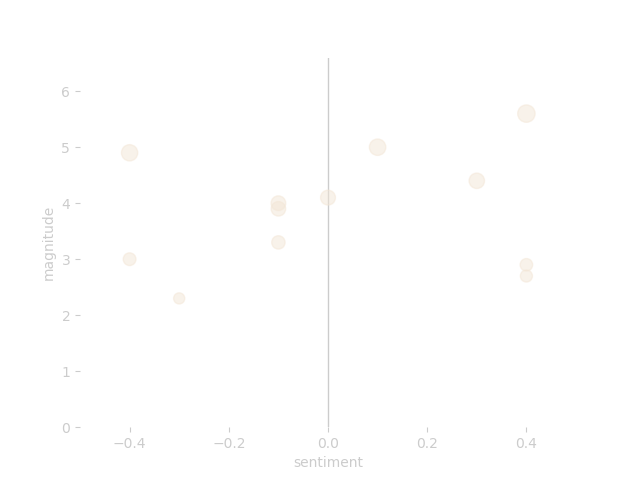
After completing the initial visualisation, I got rid of all the sentiment-related colours (reds, greys, and greens) and applied a colour from the album cover. In this case, I chose a skintone from the picture of Tim himself:
To me, the result is once more an interesting and abstract visual of a full album.
Making it more abstract
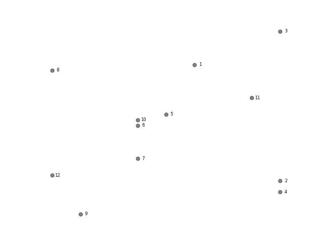
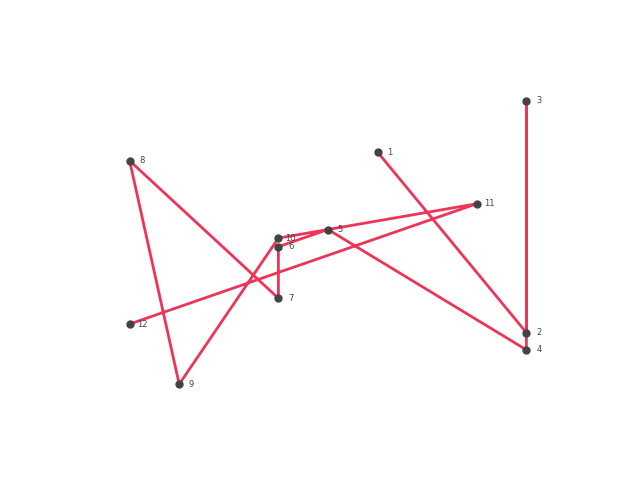
Even though I’m quite pleased with the scatter plot design, I felt the urge to do something new with this album. Initially, I had no idea where this urge would lead me. But it turned out to be really interesting. Let me explain to you what it is. First, we will have another look at the visual. If I minimise it even further and add a label to each song with the index (so you know what index they represent on the album) we get the following visual:
Using this as a starting point, I can make my program draw a line. Maybe you have done something similar when you were a small kid (connect the dots in sequence, and you have a cat!). Here’s what that looks like for my data:
Here is where it gets interesting. Python (the programming language I use for this project) has a data visualisation solution (the Matplotlib package) that allows me to create the dot visual (a scatter plot), and draw lines from one point to another (as you see in the image above). The cool thing is that you can curve the line based on the values of each dot (technically, they are called Bezier curves). Here’s a basic example of how those curves work:
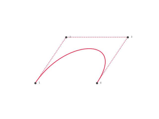
This example uses 4 fictional data points. The line starts at number one, curves towards point 2 and 3, and ends a the fourth data point. Applying this to the songs of Avicii’s TIM, I get some interesting results. Here’s the graph you saw before, with a curved line instead of a straight one:
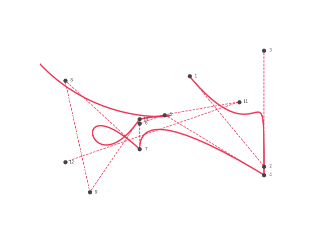
The line starts at the song Peace of Mind, the first song on the album. It ends at the open end on the left.
What I don’t really get is why it moves up at the end (as you can see, the black end on the left is way off compared to the end of the red line on the left). To be honest, I’ve tried to correct that, but could not figure it out. And currently I see a kind of the beauty in the little ‘issue’: it’s an organic line that represents a machine’s interpretation of music, and I don’t really get how it draws some parts of it. Why would I need to understand a machine’s interpretation of music if I sometimes don’t even understand my own?
When I remove the dots, you will get a better view of how beautiful the organic line actually is:
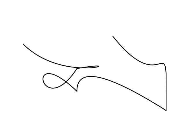
To me, seeing an album represented in such an organic looking line is magical. It looks like a hand-written signature of the album. The coolest thing of the visual? I can clearly see the a ‘ T’ in there. Both the album name and more importantly Avicii’s real name is… you guessed it: Tim.
I do feel a bit mesmerized that this is all generated by code.
A new t-shirt
I like wearing the stuff I generate, so I again prepared the new visual for print. Just as with the dots, I picked a colour of the album cover. I opted for a skin tone of Tim’s picture on the album for the line, and went with a dark grey from the picture for the t-shirt. Here’s a picture of me wearing the line-based Avicii t-shirt:

I have to say: I am (again) really happy with the result. I like how it looks like ‘a t-shirt with an abstract line’, even though that line represents the music of Avicii’s posthumous album.
A personal note
I haven’t spent as much time with his latest album as I have with his previous music. But I do have a favourite song. It is the 11th song on the album: Never Leave Me. According to the analysis it is positive (+0.3 on a scale from -1 to +1) and has a magnitude of 4. And I have to say, the song sounds like one big thankyou to some amazing lady. What strikes me is the end, and how the end of the song perfectly matches the lyrics:
She knows how I’m feeling
She banishes all my demons
So easy, like breathing
She bandages all my bleeding
She knows how I love her
We take it down undercover
She gets me, she sees me
I hope that she’ll never leave me
And right after the last line, I hope that she’ll never leave me, the song stops and leaves you.
Visit my project page for the latest updates about this project.
I also run a course on this project. If you would like explore the idea in more detail and get hands-on experience with the concepts, have a look at my course page.