
This page contains an overview of my Avicii Open Data Art project. It’s a project I’ve been working on since April 2018.
If you’re new to the project, I highly recommend you start by reading this page. I’ve tried to make the explanation here as accessible as possible. It is a project that uses data analysis and creative coding to create abstract data art.
As you can see below, I printed the result on a t-shirt. I hope this will make you curious to read on 😊

At the bottom of this page, I link to project-related resources that help you dive into various aspects of the project.
Origin of the project
The story has a sad beginning. I remember being at a networking event in Eindhoven, The Netherlands, on April 20, 2018. A colleague walked up to me and said:
Avicii has died.
Having just watched the documentary True Stories, which to me ended on quite a positive note, the news hit me right in the heart…
A few weeks later I started wondering what would happen if I’d use my skills as a data analyst to find new meaning in his music.
Analysing the Lyrics of Avicii’s music
The starting point of my project were Avicii’s lyrics, as he was very involved in writing the lyrics of his album releases. Using a technique called sentiment analysis, I transformed each of his songs into a data point. Each data point contains two values:
- Sentiment score. Ranging from -1.0 to +1.0, it tells us if the lyrics contain mostly negative or positive texts.
- Magnitude. This tells us how strongly the emotion is represented. To give you an example, you could say that ‘I like this t-shirt’ is a positive text. The line ‘I really like this amazing t-shirt!’ is also positive, but more powerfully expressed.
I can apply this technique to a song as a whole. Here’s an example of Avicii’s song Heaven from the album TIM turned into a data point using sentiment analysis:
{
  index: 2,
  title: 'heaven',
  album: 'tim',
  sentiment: 0.4,
  magnitude: 2.9,
}
The index is the index of the song on the album, the title holds the name of the song, the album the name of the (you guessed it) album, and score and magnitude contain the sentiment data.
After converting each song into a data point, I can visualise the results.
Visualising Avicii’s Lyrics
I visualised the results using scatter plots. These plots show a dot per song. The horizontal axis is set to the sentiment scores and the vertical axis is set to the magnitude. The magnitude value also increases the size of the dot.
Looking at Avicii’s posthumous album TIM, I get the following results:
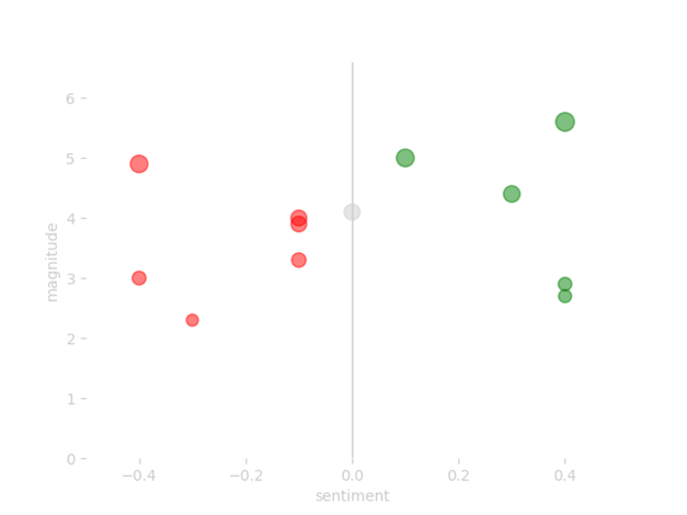
Notice how this shows a sort of special relationship between the songs.
When sharing my project with other people, I generally get questions about the true meaning of this analysis. And I get that.
Music is a personal thing.
Lyrics alone can be interpreted in numerous ways. And sounds can play a huge, sometimes defining, role. Having an algorithm ‘score’ lyrics automatically doesn’t always match how we, as people, experience a song.
This is one of the reasons why somewhere around June 2019, I moved my focus away from true ‘meaningful’ data analysis and visualisation.
Refocus on data art
So I took things in a new direction.
(I call the direction data art these days, but only learned that was a thing after someone told me.)
Instead of applying the red and green colours to the dots, I simplified them. The result is a sort of connect-the-dots drawing:
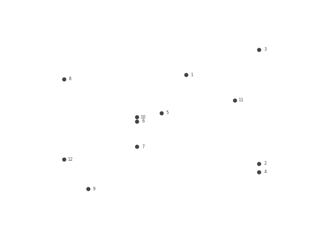
Maybe you made some of these drawings as a kid, where you connect the dots and ‘magically’ draw a cat.
I wrote a program that does the drawing for me and connects all the dots. The program draws a line from dot to dot, starting with the first song on the album and ending with the last one. The first version I made had a straight line:
I found this result a bit too edgy. Too hard, so to speak.
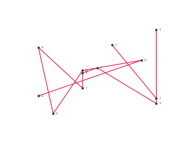
Because of this edginess, I tweaked my code to make it draw a curved line instead. (Technically the curves are generated by applying a so-called Bézier curve, originally designed for car modelling.) The image below shows you how it works using four simple points:
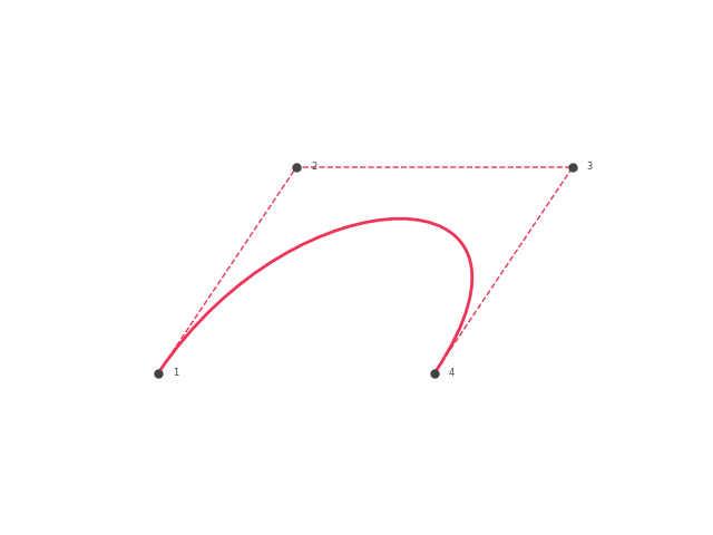
You see that the line starts at 1, is then pulled towards 2 and 3, before ending at 4.
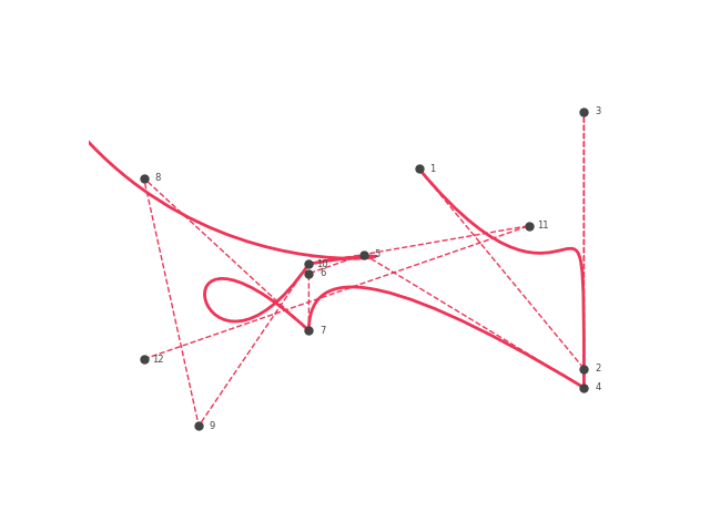
I can apply the same method to my data points of the music album. This makes the line start at song 1, pull towards song 2 and 3, before ending at song 4. The next part starts at song 4, pulls towards song 5 and 6, and ends at song 7.
You get the idea.
Generating a visual using curved lines instead of straight lines gives the following result:
Here’s a cleaned up image of the result:
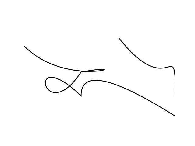
Now that is what I call a beautiful line. right?
To me, it mimics a handwritten signature. And you don’t need that much imagination to see a T in it (if you don’t know: Avicii’s real name is Tim Bergling). This is all generated by transforming Avicii’s lyrics into data and creative coding to visualise the results.
It’s on the one hand very technical, but on the other the result looks very organic. That’s what made it feel magical to me.
Taking it into the world
I also like the idea of taking the project out into the world. The result looked too good to just leave on my computer as a digital file.
So I started printing some of my results on t-shirts. Here’s a picture of me being happy with my Avicii t-shirt:
Open data art project
There have been lots of twists and turns while working on the project. One of the things I decided along the way was that I wanted to focus on sharing the project code.
The project is open in two important ways:
- First, the project code and assets are open to anyone who wants to use it.
- Second, the project is open-ended. I’m still learning new things and adding them to the project, and other people use it in very creative ways.
Useful links
Here’s an overview of other resources you may be interested in:
- Github Repository (Python) – You can use this to apply the project to any piece of text.
- Project assets (data and visuals) – you can use these if Python is not your thing, but feel like using my data and/or visuals.
- Python Dataviz Course – a 4-session course that teaches you how to use python in data visualization projects.
- Stories:
I also give talks about the project and have run courses at colleges and universities. If you have questions regarding that, contact me here.
Project development
I want to open up this project as much as possible. One of the things on my list is to add a free and open alternative to Google’s Natural Language API. If you have any suggestions for this, please do reach out to me.
I also consider setting up a project art repository that includes an overview of things that people have made using the project.
A big thanks to Avicii
Most importantly, I want to thank Avicii. His music was and still is an amazing source of inspiration.