
I’m a big Formula 1 fan. I’ve watched the sports since I was eight years old. People sometimes ask me why I like it so much. And to be honest, I don’t really know why. For some reason, I get excited when the race is about to start. Sometimes all the excitement during the race is in the changing numbers in Formula 1’s sidebar. And I’ve been thinking about that very common graphic a bit more lately.
Formula 1’s sidebar
Let’s first review the sidebar graphic I’m talking about. Here’s a screenshot from the sidebar during the 70th Anniversary Grand Prix in 2020:
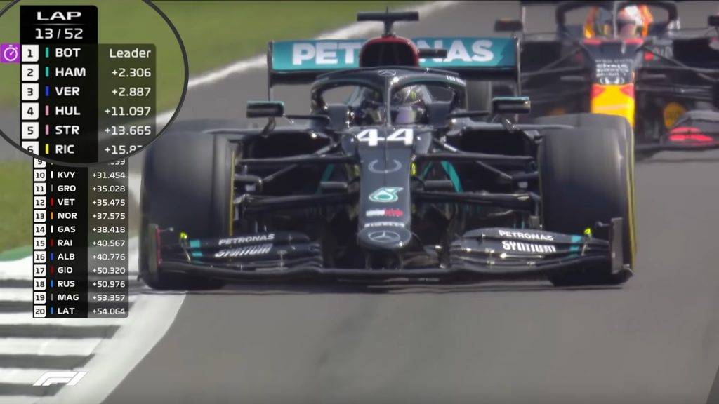
Modified screenshot from the Grand Prix highlights from Formula 1’s Youtube channel. All rights belong to Liberty Media.
The interval timings show the gap between two drivers. Nothing complicated there. But to turn those numbers into knowledge, I need to do some thinking:
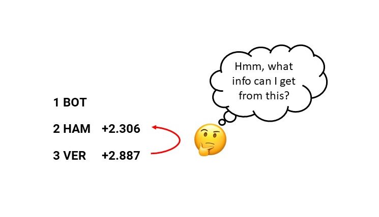
What do those numbers tell me?
Turning driver gaps into knowledge
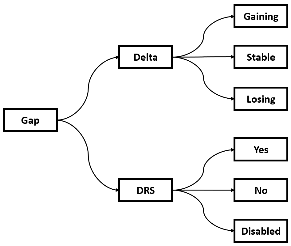
The change in the interval between Formula 1 drivers tells you what is happening. If a gap is shrinking a driver is closing in and might get a shot at overtaking the car ahead. If a driver is within 1 second of the car in front of him DRS is enabled. With DRS chances of overtaking increase significantly. Here’s a decision tree of what changes in the gaps between Formula 1 drivers can tell you:
I noticed that sometimes I have my eyes on the interval timings of a driver I like (e.g. Max Verstappen or Lando Norris) and watch how they change. During the first few laps of the 70th Anniversary Grand Prix this resulted in some interesting information. At the start of the race, the Mercedes, or Black Arrows, very slowly pulled away from Verstappen. But a few laps later, Verstappen was closing in on Hamilton who was on softer tire. Interesting and very exciting!
As an F1 fan this information is quite easy to extract on the fly. But for casual viewers, it may not be that easy.
Updating Formula 1’s graphics with icons
Based on the decision tree I shared earlier, I set up ‘if this than that’ logic for the Verstappen-Hamilton example I just shared:
- Gap is changing:
- Car gains more than 1 second = BIG GAIN
- Car gains more than 0.2 seconds = GAIN
- Car gains less than 0.2 seconds or loses less than 0.2 seconds = STABLE
- Car loses more than 0.2 seconds = LOSS
- Car loses more than 1 seconds = BIG LOSS
- DRS:
- Gap is less than 1 second = DRS
- Gap is more than 1 second = NO DRS
- DRS is disabled by stewards = NO DRS
As a next step, we can translate this setup into icons. Here are the icons for the changing gaps:
![]()
And these are the ones that show you if DRS is active:
![]()
I decided to go with changing icons and changing colours in both icon sets. Using a change in shape and colour makes sure that colour-blind people (red-green colour blindness is quite common) can clearly understand what is happening.
Putting the visuals into practice
Now let’s put the new icon design into practice. I’ll use the example from the 70th Anniversary Grand Prix situation I discussed earlier:
![]()
Notice how the Verstappen-Hamilton situation becomes way easier to understand:
- In lap 13 the gap is steady.
- In lap 15 Verstappen starts gaining.
- In lap 17 Verstappen is close enough for DRS.
The icons could be combined to convey extra information. For example: when a driver is close enough for DRS, the gap temporarily becomes stable (as the driver reaches the car ahead). But on the other hand, the car is also ready to overtake. So instead of disabling the GAINING icon, I combine the GAINING + DRS icons to indicate that a driver could be overtaking the car ahead. It allows viewers to instantly see where the battles are.
The icons could also be applied when someone just pitted and there are some cars between the first driver and the chasing one. Here’s an example of what that would look like when Hamilton has just pitted and Bottas has not pitted yet:
![]()
As a last example, I’ll show you how ‘a DRS train’ (a term used when multiple cars are chasing each other in DRS range) becomes super easy to spot when using the icons:
![]()
Pretty nice right?
Keep it simple
Information design can often help people see what is happening. In Formula 1, timings tell you the basic progress of a race: who is gaining time and who is losing time. And I think the use of icons can make that information more accessible.
Cover photo by Abed Ismail on Unsplash.