This story starts on April 23, 2020. On that day, I received a message from Kylie. She wanted to make a video about coding projects about Avicii. She did some Googling, found my Avicii project, send me a message, and asked it if it was okay if she made a video about it. My answer: yes!
Kylie’s video
Let me show you the video she made of the Avicii project. Kylie did a great job explaining the project, the concept of natural language programming, and sentiment analysis. She ends with some examples she generated on her own by using my project code. It other words: she made a really nice video.
It is nice to see someone use your code when you decide to share it publicly. And it is even nicer to see them create good content about it!
Finding Magic in New Music
I remember how I first found magic in my abstract visualisation when analysing Avicii’s TIM last year. The visual contained a T-shape, resembling both the Avicii’s real name and the album title. There was a gem just like that in the music Kylie had analysed.
The Chainsmokers Dataviz
One of the data visualisations she made was of the album World War Joy by The Chainsmokers. The result is another beautiful organic looking shape:

Data visualisation of the sentiment in World War Joy by The Chainsmokers.
Now this look likes an A right? And beautiful A if you ask me. Guess what the names of the duo behind The Chainsmokers are? Alexander and Andrew. Need I say more?
Next up: turn the visual into something I can wear.
Embroidering the Chainsmokers Dataviz
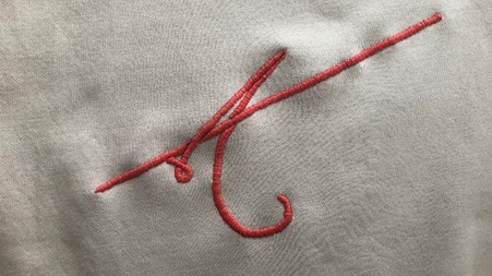
I had the idea to do create a nice sweater from one of the designs for a while. To make it a bit extra special, I looked for ways to embroider it on a sweater. I could not ignore the Chainsmokers visual that Kylie had created, so I knew that would be the one to end up on the sweater. After discussing the embroidery idea with my girlfriend, she wanted to give embroidery a try herself. So she did some research, got some of the required tools, and did a really good job on the sweater!
May I present to you: an embroidered data visualisation of a music album on a sweater:

Close-up of the embroidered visual.
Here’s me wearing the sweater:

Me being happy with my sweater and acting all influencer-like.
Again: pretty nice if you ask me.
Listening to World War Joy
Now the funny thing here is that I did not listen to the album before I saw Kylie’s visual of it. So this time the process was reversed: I first saw an interesting visual and listened to the music after that. And I quite liked the album! My personal favourite so far is ‘Do You Mean’.
Thanks Kylie, for reaching out to me, making the video, and introducing me to The Chainsmokers album. The internet can be such a nice place.
This post is part of my Avicii Project. An ongoing project in which I visualise a machine’s view on music lyrics.
