This post is the result of two things. First, taking part in the 2024 Du Bois Challenge reignited my passion for python data visualization. Second, I saw a creative data visualisation by Alli Torban (more on that later) that would be a fun to recreate in python.

In this post, I’ll share my approach at this recreation attempt.
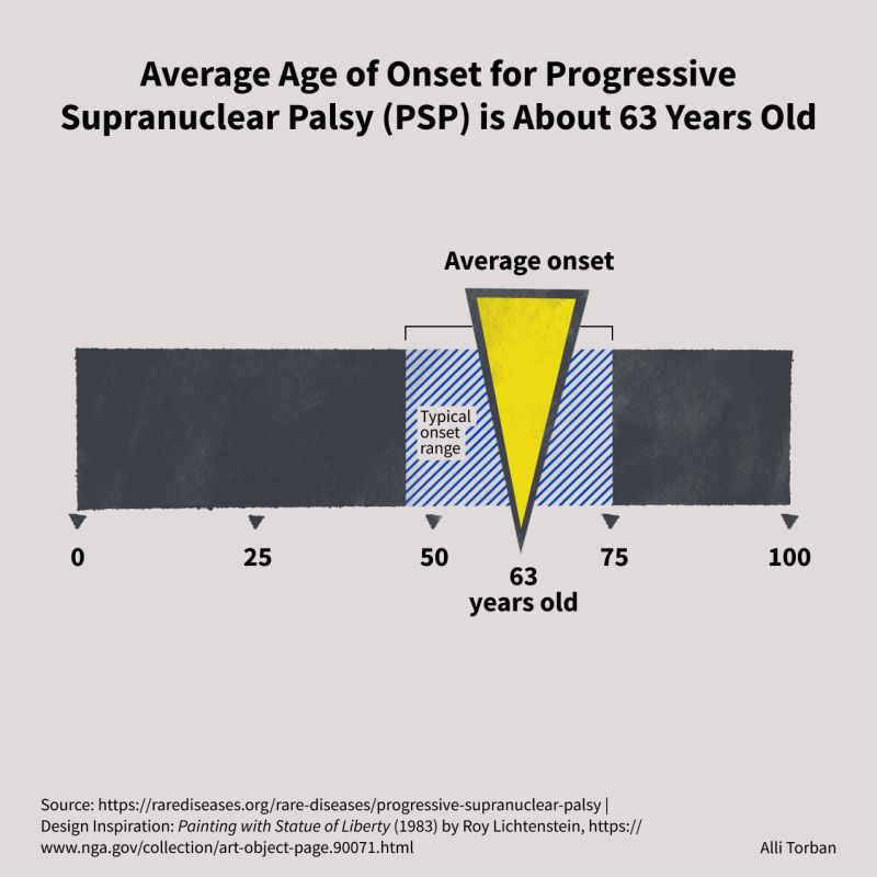
The original: a data visualisation about Progressive Supranuclear Palsy
I like the work of Alli Torban. She applies data visualisation in creative ways. And not long ago, I saw one of her creations for the #30DayChartChallenge:

I’m someone who likes both creativity and minimalism, and this design strikes a nice balance between the two. So I reached out to her, asked if I could have a go at recreating it, got a yes, and put it on my list of ‘things to try’.
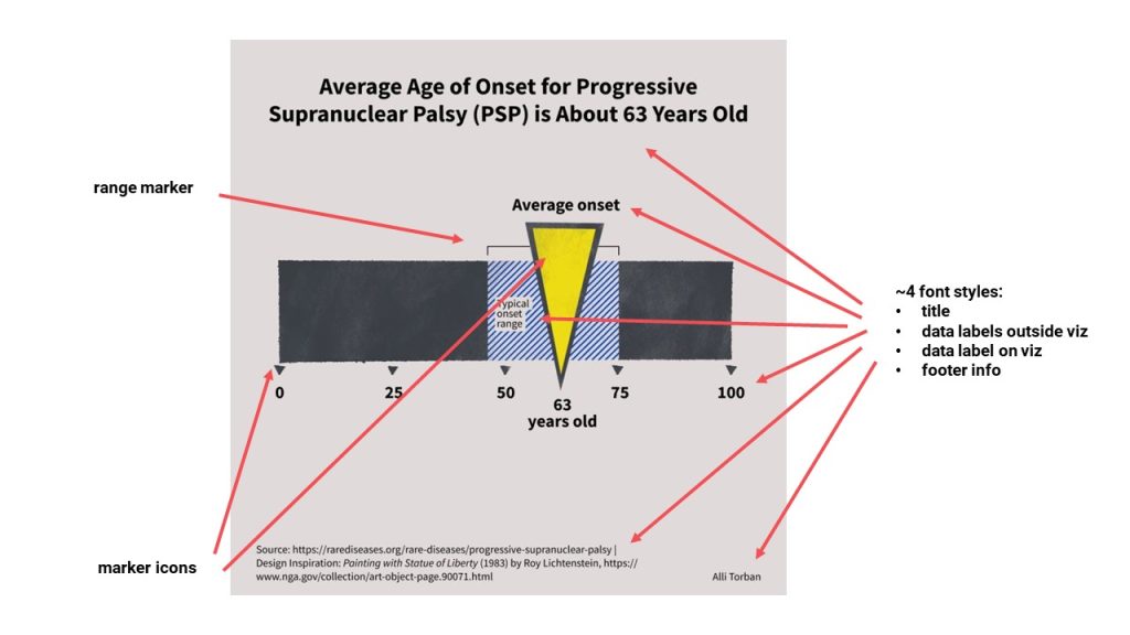
Breaking it down into elements
When I see a visualization like this one, I quickly start breaking it down into visual elements. These are the things that I need to recreate with code.
Technically, I view this as ‘a bar chart with some extras added’.
Let’s have a look at those:

If the Du Bois challenge has taught me one thing, it is to be creative and playful with the capabilities of a tool. So for this beautiful collection of visual elements I’m going to do just that.
The draft visualisation
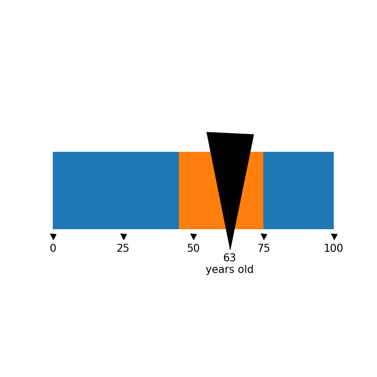
When I start coding a visualisation, I aim to work towards a draft visualisation. This is the visualisation that technically is what the original is. And in this case, that is a bar chart.
In her post on linkedin, Alli Torban added the data source. With that, I looked up the data to make the draft visualisation and got to a first bar chart.

This is a very utilitarian visualization. Not that beautiful yet, but functionally it is what the original is.
I’ll add a few extras to this viz: the numbers at the bottom, some markers to keep them company, and the larger marker for the average value. And I’ll clean it up a bit.

Now when I swap the default dot markers for a custom one, you quickly get to see hints of Torban’s design idea:

Pretty cool right?
This is good moment to consider the added value of design for a data visualization. The viz you see above misses a few elements (e.g. some titles and labels), but it technically is a similar visualisation of the same data. By making certain choices (e.g. the use of custom attributes and what to use for titles), a designer has a lot of impact on the end result.
Implementing Alli Torban’s design
Alright, there are a few things I need to do now to get closer to Alli Torban’s design:
- change the markers to custom ones (already done!)
- change the colours
- add the onset range line marker
- apply custom fonts
- add title and sources
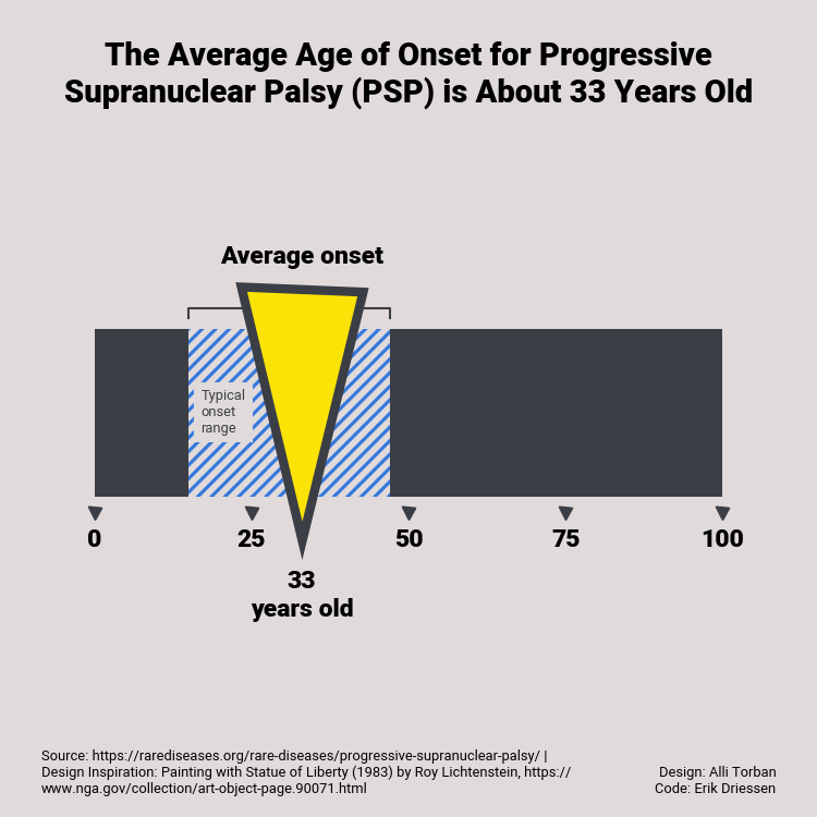
Now when we do all that, we get to this visualisation:

It’s not a perfect match, but a pretty good recreation I think 🙂 and a good example of how a basic visualisation tool can benefit greatly from a good design idea.
The cool thing about recreating it in code, is that the visualization can be easily updated. This is also a good test to see if the code really works well with different datasets. When I rerun the code with some fictional new data, bot the visualization and the average age in the title are updated in a single click:

Pretty good!
Code it yourself
Want to have a look at the code? I have a python notebook that shows you how to make this viz. You can find it here.
