
I’ve been working on a new personal data art project since the summer of 2024. It has posed some interesting challenges.
For example:
How do you go from one data art piece to a series?
Let’s have a look.
The idea
The project focuses on the novels of Haruki Murakami. I discussed the origins in more detail in an earlier post, but the idea is simple:
Create a data visualisation of Haruki Murakami latest novel: the city and its uncertain walls.
That initial idea, combined with some iterations, got me to this visual:

A pretty nice visual and one I liked so much, I just had to have it printed. I then framed it and put it next to the book:

It felt pretty cool already to make something like this, based on a book I really enjoyed. But it also felt like it wasn’t done yet.
The first result
The title of this section is a bit misleading. I made things before the first result, but the first result is the first thing where my thought go like:
Yes, this is something that could be an end point.
You might say that the previous section is about version v0.1 to v0.X and this is about v1.0 to v1.X.
Anyway, the thing that helped get here is time. When an idea pops up in my head, I find it hard to not work on it. But this isn’t always the best thing to do.
Funny side note: in Mr Murakami’s novel about running – what I talk about when I talk about running – he shares some thoughts on his writing process. He sets a fixed amount of time per day (e.g. 4 hours) to write and always stops when that time has passed, even though he might be a in a really good writing flow. In his view, this forced stop increases the chance of a good flow when he continues the next day.
Besides this wisdom from the author, my wife also contributes a big deal to my projects. She’s not afraid to push me forward, ask the hard but important questions, or convinces me that some lingering time might be what the project currently needs.
I wanted to add colour to the visual and was struggling a bit with that. Here’s a draft from that period:

As you can see, my ink almost ran out.
After a while, and after some time, I applied colour in a way I enjoyed:

The colour, called greyish lavender, is sourced from the book Dictionary Of Color Combinations (vol. 2) by Haishoku Soukan.
The series
Throughout the project, I had the idea to turn the single visual into a series, a series that would include all the longer novels by Haruki Murakami (it is currently limited to the ones in that list that I’ve read).
But a challenge I kept getting back to was:
How do I keep a consistent look over the series?
The original book has 70 chapters and with it, a nice 7 by 10 grid.
But the other books don’t have a seven-fold chapter count. Should I find a grid of X by Y that fits the chapter count? This turned out to be pretty hard too.
After a while, I decided to take a more creative approach to the grid layout. The setup would still be based on the 7 by 10 grid of the first print (as that is also the book that the project originated from). Every other book would stick to a seven-chapters-per-row grid, but deviate from it based on the story in the book.
Let me explain book by book.
Warning, some very mild spoilers ahead.
1Q84
The story follows two people that have lost each other and somehow are pulled towards each other. The chapter count is 79. That is 7 x 11 and 2 extra chapters. I used those two extra chapters to visualise the two characters, with chapter 1 all the way at the top and chapter 79 all the way at the bottom.
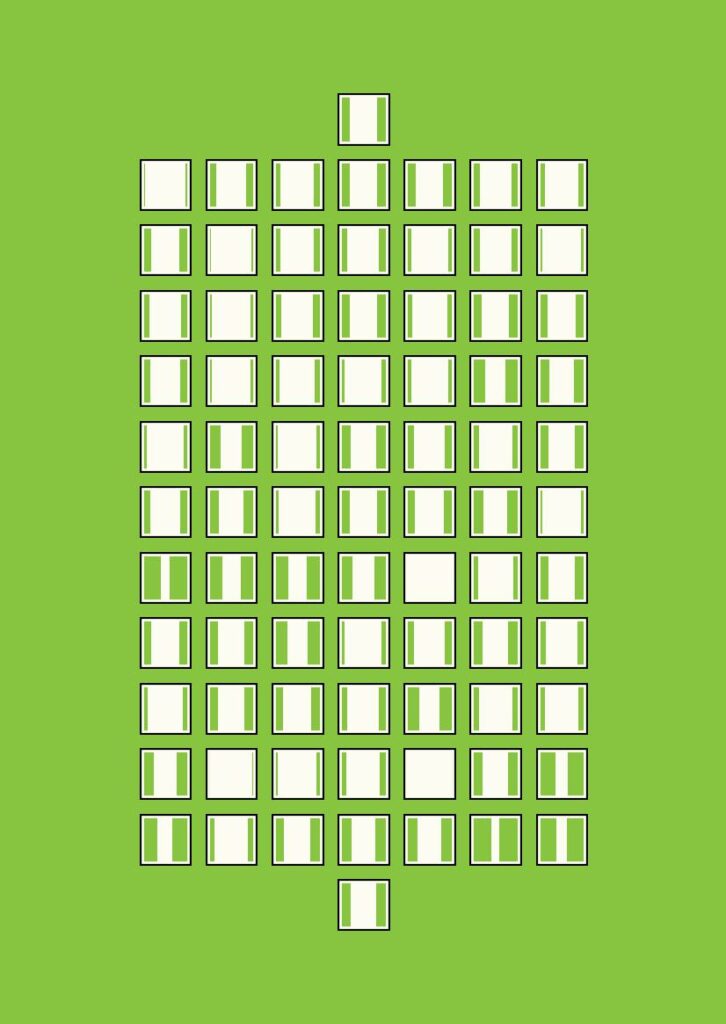
The colour green needs no explanation for those who’ve read the story.
Kafka on the shore
There are two chapters in this story that don’t have a chapter number, but are called the boy named crow. This is very first chapter and the one right after chapter 46. I used these two chapters to ‘break’ the seven-chapters-per-row grid.
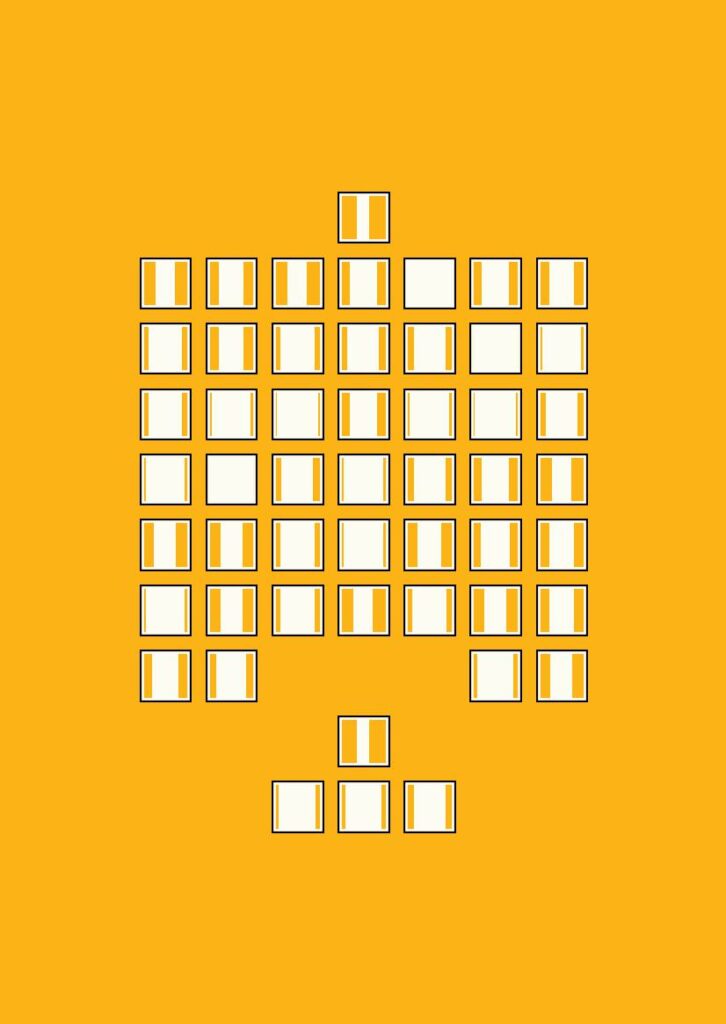
The colour yellow is based on the beach.
The wind-up bird chronicle
At some point in the story, the main character in the wind-up bird chronicle visits a large office-like building regularly. I tried to get to an abstract visualisation of that building using the seven-chapters-per-row layout.
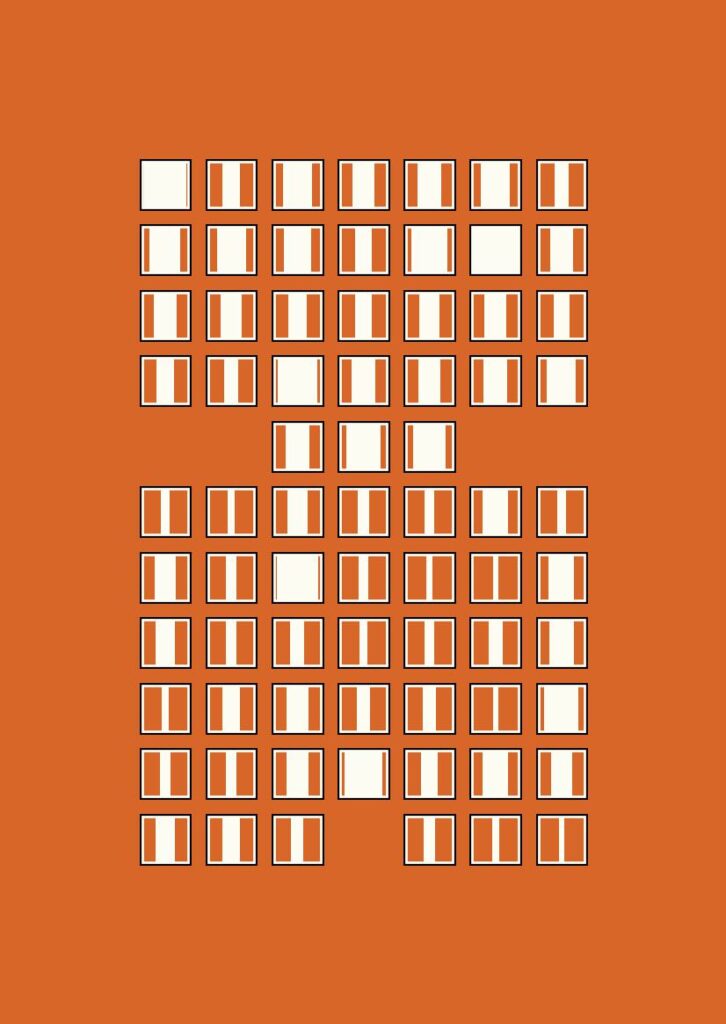
The colour red is a based on Malta’s hat.
If you haven’t read the story, don’t worry, the previous line actually makes sense.
What’s next?
I plan to slowly add the other novels to the project. This slow approach feels like a good fit for the types of stories Mr. Murakami writes and, also, I just don’t want to rush through them.
So time is what this project currently gets.
Haruki Murakami Art project page
Curious to learn more about the project? Visit my Haruki Murakami project page.