
New data visualisation ideas seemingly pop up out of nowhere. It’s one of those rare moments when my brain links two things together, pushes this new conceptual blend forward, and I think:
Now that is an interesting idea!
I’ve recently come to peace with a way of working with these ideas. I normally share them when they are done or as done as I want them to be. But I thought it would be interesting to share a project in an earlier state. This way, I can share the way I work on my data art projects and when I think:
Yes! This is a good idea to invest time in.
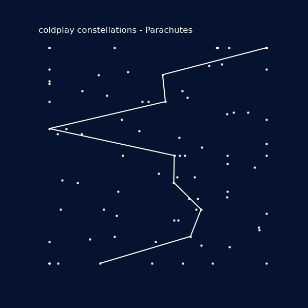
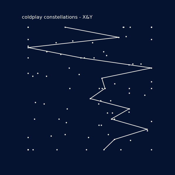
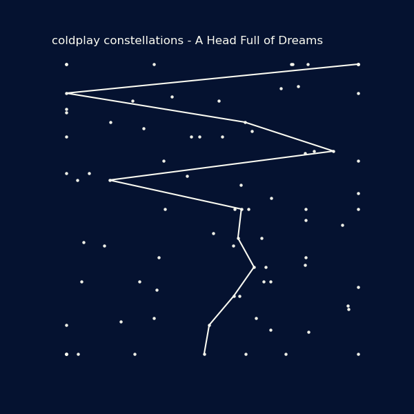
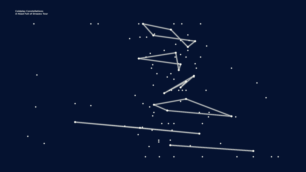
The current state of the Coldplay Constellations
Before we dive into my process, I’d like to share the state the project is in currently:
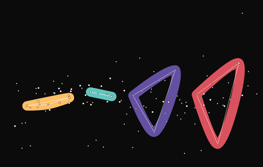
These constellations are based on the Coldplay’s Live Head Full of Dreams album. The constellations are the sides of the vinyl record of the album tour (A – F). Every star is a song from the songs released up to the live tour, including ones not played during the tour.
Now you know where the project currently is, let me share with you how I got here.
The Process
Over the years, my process has changed in one important way:
I stop jumping behind my computer and spend more time with the idea just lingering in my head.
I have the feeling that this works well for me. Maybe it’s because ideas pop up ‘out of nowhere’ in my head. By leaving them there, in my head, they stay close to their source. During this process, the idea migrates slowly from idea form to a list of tasks.
This is an attempt to name the phases of that process.
0: The idea
Ideas are the most important part of my data art projects. I cannot plan these. They are there all of sudden and often I can point to important moments that allowed the idea to form.
Let me name a few for the Coldplay Constellations idea:
- My wife and I like to listen to Coldplay. We listen to them during trips and I have a few records at home: X&Y, Head Full of Dreams, Music of the Spheres and Live in Buenos Aires (or Head Full of Dreams Live).
- Chanting Viva la Vida’s WHOHOHOHOHOOOOOO during a live concert is a magical feeling.
- When I close my eyes an listen to the live recording with a good pair of headphones, it feels like as close as I can get to that magical feeling without actually going there.
- Recently, I discovered the documentary that came with the live album. It’s interesting to see Coldplay transition from their first gig to the Head Full of Dreams world tour. I also noticed how Chris Martin emphasizes how we are all ‘one big family’ on the same planet, that we have to do things together, and the album focus on a positive message.
- I think these ideas further developed into their album Music of the Spheres, which style refers to planets, space and celestial bodies.
The combination of Coldplay’s space themes, a personal fascination with space and a love for data art projects made my brain go click:
Can I visualize a Coldplay live concert with a star map?
This happened right before going to sleep.
Is it a coincidence that Coldplay made a song with Tim Bergling (Avicii) called A Sky Full of Stars and my first data art project is about Avicii’s work? Maybe. Maybe not.
1: Think, don’t start
Next up is the first step that I can plan, or maybe I should say control. I used to get going behind my computer as quickly as possible. Nowadays, I postpone this step for a while. It allows the idea to mature in my head.
With the idea formed, I ponder a new question:
How could the Coldplay Constellations work?
Some elements form:
- Songs could be stars.
- Constellations are links between the songs.
- Include all the songs released up to the tour, so the starry sky has more songs than just the ones in the tour.
I like where this is going and start planning the next steps. I like to think of small tasks I can complete, they are mostly a mix of simple work or work with a time limit (e.g. work 1 hour on this).
My next two steps would be: data preparation and data visualisation.
2: Data prep
I know that the songs form the stars of the sky full of stars, so I have to collect some data of the songs. As I don’t know yet what data I’ll end up using, I decided to collect the following per song:
- Album
- Year of release
- Month of release
- Index on the album
- Name of the song
- Duration of the song
I then collect this data (thank you Wikipedia) for the following albums:
- Parachutes
- A Rush of Blood to the Head
- X&Y
- Viva la Vida
- Mylo Xyloto
- Ghost Stories
- A Head Full of Dreams
I know that I miss a few songs (e.g. songs that are only part of the live tour), but I decide to handle that later.
It takes me about an hour to set this up.
3: Data visualisation (and accepting defeat)
Next up, I plan 1 hour of data visualisation time.
In 2024, I improved my data visualizations skill a lot by working on the DuBois Data Visualizaiton challenge. After the 10 weeks of the challenge, python and matplotlib feel closer to using a pen and paper.
Data visualisations to through two phases for me:
- Functional: see how the data looks without spending to much time on form.
- Styling: working towards the final form I have in mind (stars).
Let’s have look at the visuals I made within this hour.
The albums
The first visualizations I make are scatter plots per album. They show the song duration on the x-axis and the album index on the y-axis. (At this point, I decide to go with these two attributes.)
Let’s look at some examples:
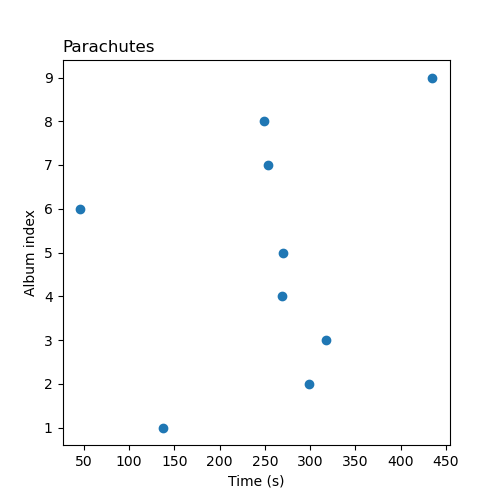
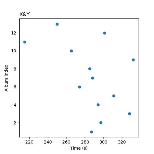
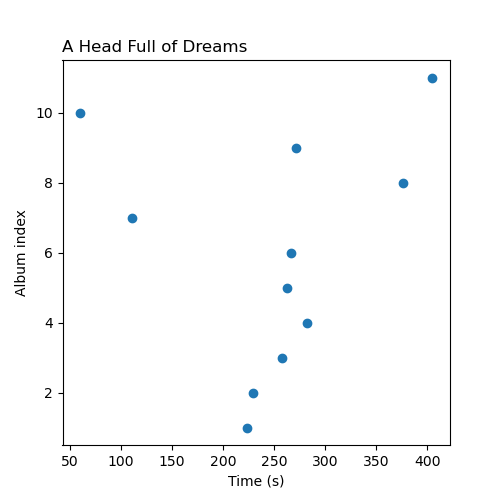
Alright, this works.
(Later I note that the y-axis should be flipped. Right now the first song is at the bottom, which feels wrong to me. It should start with song 1 at the top.)
I now know that I like to work on data art projects that combine simple and easy-to-understand data with creative applications of standard visualizations. This project is a good example: simple music album data converted to star maps using scatter plots and line charts.
The next one combines the data of the albums into a single plot.
I decide to normalize the data (both index and song), so all the album data overlap, and draw lines per album to see how that would look as a constellation. Making constellations per album is not a goal I currently have in mind, but an interesting side step that also allows me to test my idea.
Here are the same three albums:
This looks promising.
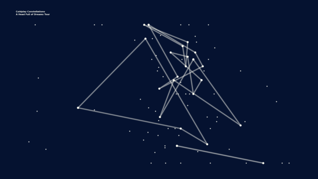
Next up: a constellation based on the tour. I get the track list of the tour (again, thank you Wikipedia), I also know that I still miss a few songs but that is okay. I modify my code so it uses the songs form the tour, add some glow to the lines, and get to this:
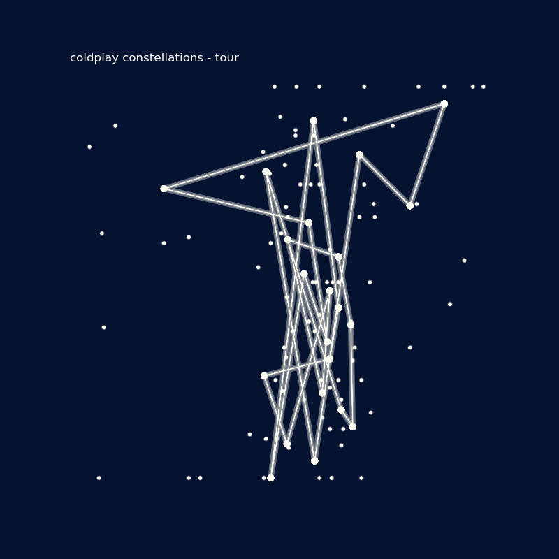
Yikes. I do not like this visual. It’s way to chaotic.
I ‘accept defeat’ and my 1 hour of work comes to an unsatisfying end.
4: Iterate
When I walk away from my working place, a new idea forms:
What if I split the songs per side of the vinyl record of the album? It has 6 sides which should result in 6 constellations.
I get an unexpected hour of free time a day later. I get the data (this time thanks to discogs.com) and decide to deal with the missing songs. I add custom data for the two live songs on the album (De Musica Ligera and Amor Argentina) and learn that Something Just Like This is on the Kaleidoscope EP, a companion piece for Head Full of Dreams, and add that to the data as well.
I also walk through the notebook with my code and figured that the y-axis is weird. As noted before, the first song is on the bottom and the last one at the top. It’ll be easier to read if the first song is at the top, where it intuitively should be, and so I decide to flip the y-axis.
Flipping the y-axis and making groups of the sides of the vinyl record get me here:
Yes! This looks good!
This the moment when I think it’s a good project to invest my time in.
There’s Dutch saying (hier zit muziek in) that we use when something looks interesting. It translates to:
There’s music in this.
It’s fitting for the project 🙂
Time spent
Let me share with you how much time I spent on this project before I got to the YES-moment.:
- From idea to current state: 3 weeks.
- Data preperation: 1 hours
- Data visualisation: 2 hours
- Writing this post: 2 hours (~ the time it takes to listen to the live album!)
That is 5 hours well spent. (Note that I do not keep track of think time during walks or right before sleep.)
There are two other things I invested time in that are important, but I did not invest in them with this project in mind. Nonetheless, they were crucial for my brain to come up with the idea:
- Time spent getting to know and enjoying Coldplay music: ?
- Time spent working with data: ~13 years
Project next Steps
As I said, this project is at a yes-this-could-work phase and not finished. Not at all.
The next steps begin to form:
- Data validation: verify the constellations and their data. I have to verify if their order is based on the sequence on the record side or the release date of the song. This might slightly influence the shape of a constellation. (With personal projects, I aim for ‘something I like’ first, spending more time on validation second.)
- Design: make the visualisation more like a sky full of stars.
- Test other releases: see how the visualisation works for other tours (maybe also albums).
- Interactivity: turn the visual into an interactive web version.
My head is full of dreams and I have plenty of things to do.
Updates will follow…
2 days later…
I spent some time on data validation and noticed I made an error mapping the vertical position of the live tour songs (it was based on the live album order, not the index of the song on the studio album). I also missed a few songs because of slight variations in song titles (basically typos).
Fixing these issues makes the overall layout slightly more chaotic, but still constellation-like. Here’s the new updated version:
The good news is that my error is an unintended proof-of-concept of how studio albums could look!
More on that later…
4 weeks later…
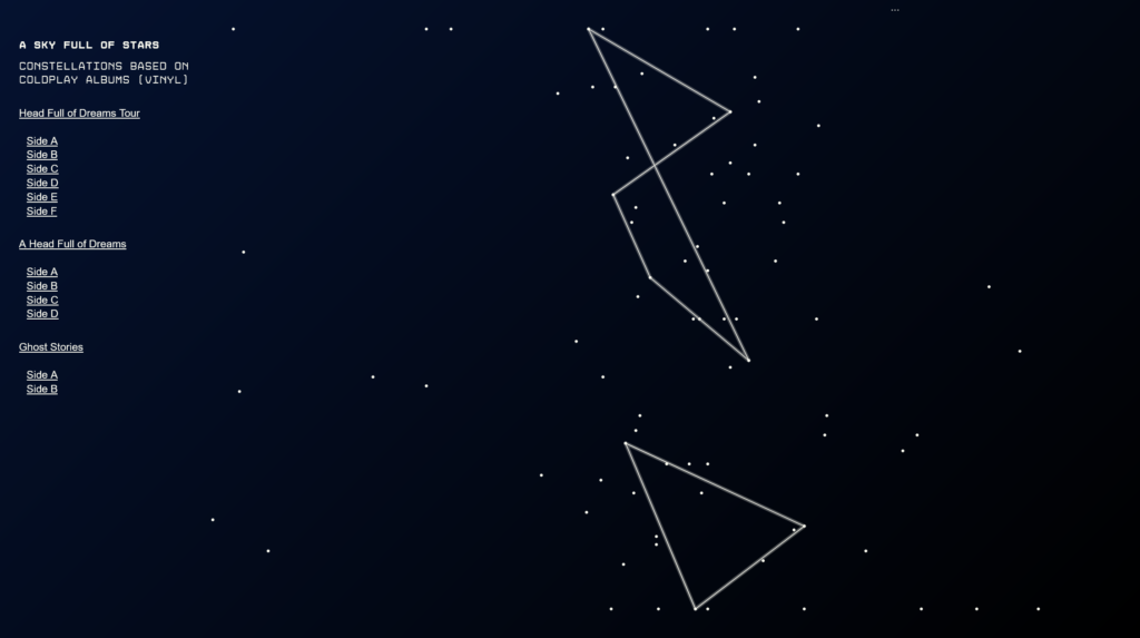
Alright, I made a first web application. It includes a few changes:
- The project has a name: a sky full of stars.
- I now focus on studio albums over the live album.
- Adds a few design updates to make the stars more star likes.
- Adds the option to select albums and sides of an album.
You can view the web application here. (Only works well on big screens.)
The next big thing I want to do is to make the project feel more like a Coldplay visual. They have a tendency to use bright, colorful and sometimes playful visuals. That is what I’m aiming for.
4 days after that
Okay, I think I have a visual direction. I won’t call it Coldplay-esque necessarily, but it’s a visual style that I enjoy. Besides a more distinct visual style, the web app has a few updates:
- I’ve swapped the axes (x = index, y = song length) for a more horizontal experience.
- It now includes some notes on the web app in the footer.
- Horizontal position now has a slight variation based on the album release year. This prevents that songs appear in a vertical line.
I’ve updated the web app.
When I explored visual directions, I learned about the idea of space graffiti and made it me think of what data graffiti could be. More on that here.