
Data visualization can be so much fun. I’ve previously used sentiment analysis to generate visuals of Avicii’s Tim and Madeon’s Good Faith. This time, the visual is based on the Ultraviolet EP by Dagny.
Why Dagny?
I first heard Dagny’s music in October 2018. She was the supporting act for Lemaitre’s show in the Melkweg, Amsterdam. And boy what supporting act she was. Me and my friends became instant-fans. Give the ‘This is Dagny’ playlist on Spotify a go if you don’t now her music yet.
The dataviz process
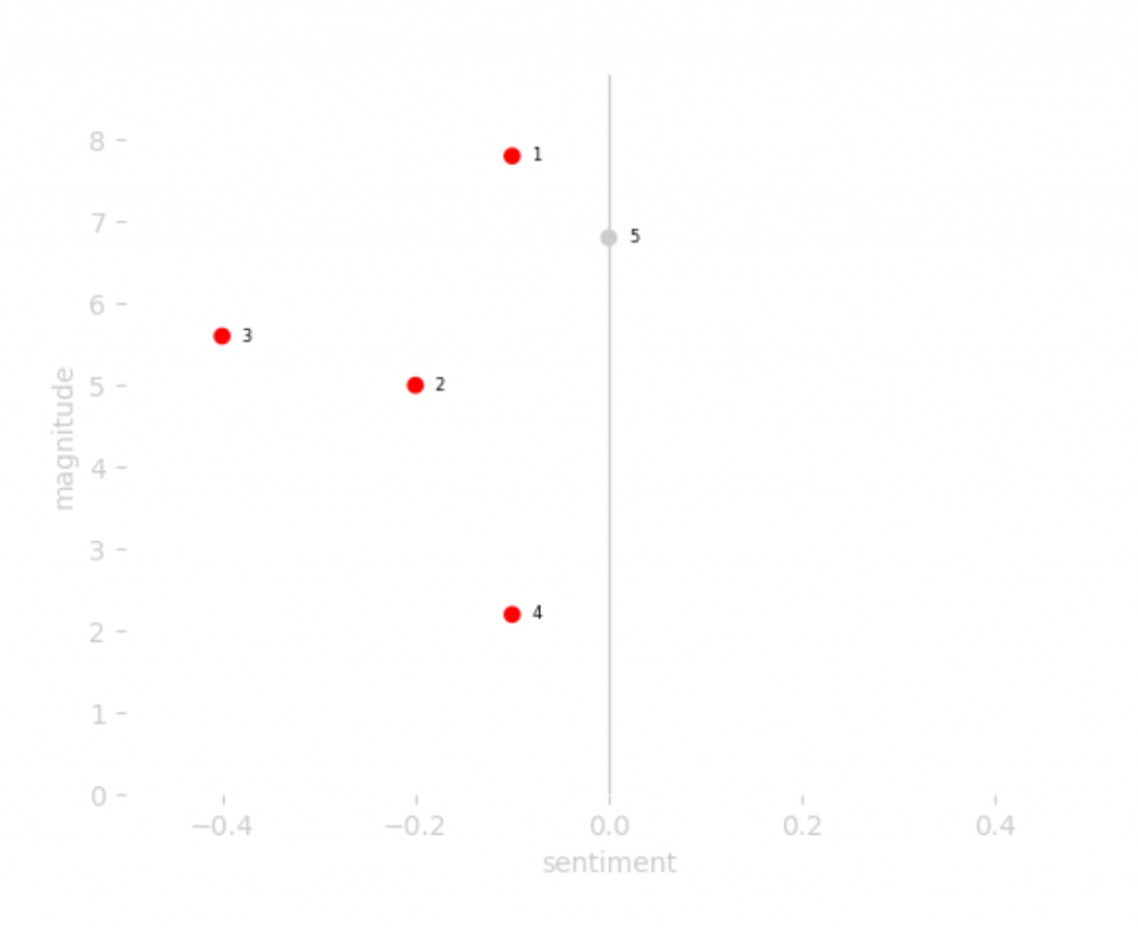
As always, I start with a sentiment analysis of the lyrics on an album. Dagny does not have full-fledged album yet, so I picked her EP Ultraviolet to analyse. These are the results of the analysis of the 5 songs on the EP:
In the next step of my process, I connect the dots. The results were a bit dull in my opinion:
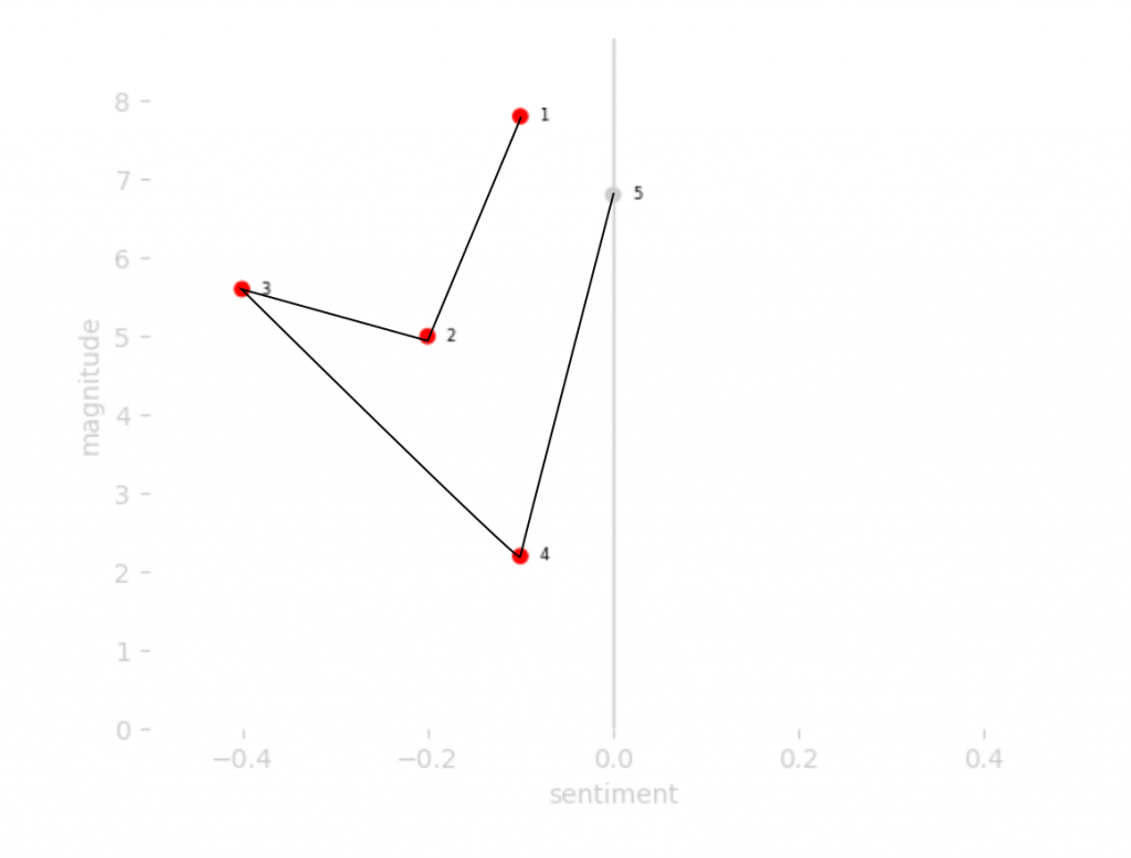
Now a dull data visualisation is not necessarily a bad thing. But I want to create some beautiful. So I tried out a new thing. I have had the idea to connect all the dots of songs on a album to one another for a while now. I hoped the effect would resemble Lemaitre’s logo, a logo that has an origami vibe to it:
![]()
Lemaitre with their logo in the background. All rights of the logo are theirs (not mine).
As this was the band she was the supporting act for, it would be really nice if the result actually looked similar.
Normally I would start translating my idea into Python code around this time in the process. But I’ve recently installed the open source program Inkscape, a free tool that allows me to draw vector images. I wanted to try and see if I can use this alternative to Adobe Illustrator for my vector imagery needs. So I decided to go with a manual visualisation process this time (spoiler: the answer is yes!).
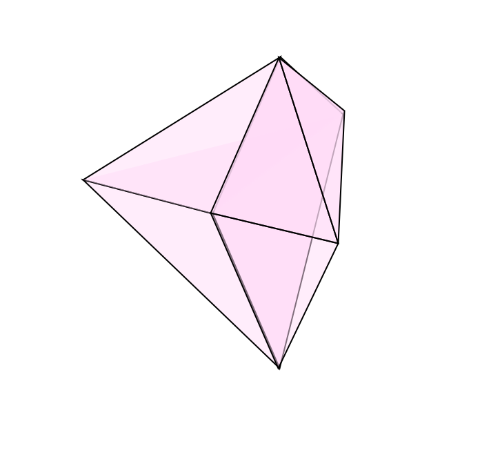
The result I got for Dagny’s EP is actually pretty interesting:
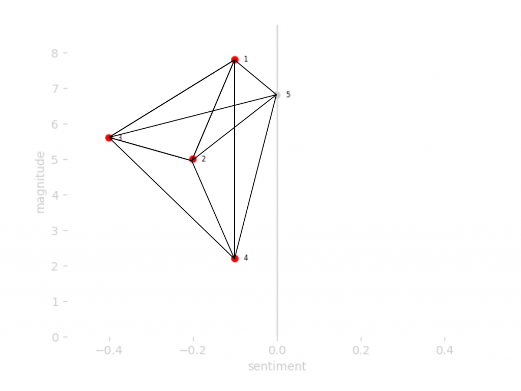
To me, the result resembled a diamond cut in half. Don’t worry if you don’t see it yet, it will become clear in a minute. I completed the diamond by continuing the line from song 3 to song 2:
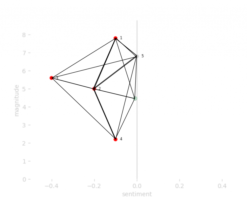
After this step, I removed all the elements of the plot and added some colour:
Pretty nice right?
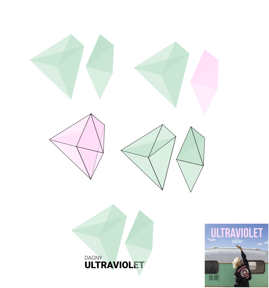
After this, I tried out a few things. I tried two shades for the diamond based on the Ultraviolet EP cover art. I tested what the diamond would look like with and without line colours on the edges, and started testing with the artist name and album title.
The final result
The last step is often about choice. What version do I like? What can I remove from the visual? I decided to go with an ultraviolet-ish colour, the Robot font (as the data behind the visual is generated by a Machine!), and picked a shade of Dagny’s blond hair as the background colour:
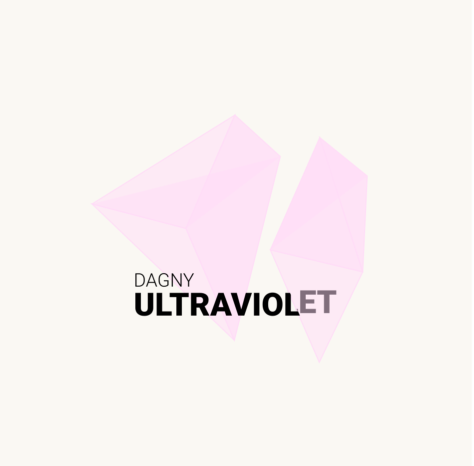
A diamond generated by data from a sentiment analysis of the Ultraviolet EP by Dagny.
Dataviz can be so much fun.
Technical details
Here’s the list of tools & technology I’ve used for this visualisation:
- Sentiment analysis: Google Natural Language API + Python Pandas package.
- Scatter plot: Python Matplotlib package.
- Vector images: Inkscape.