
I recently visited S-H-O-W 2021, a great event about data visualisation. One talk discussed how you can change your data visualisation based on the amount of interest and focus someone has. The idea is that users generally have a certain interest level (high/low) and focus level (high/low). By making a visual for each combination of these, you could improve the impact your visuals make.
For someone with low focus and interest to ‘see’ your visual, you could use animation to stand out. And so in this post, I use this idea as the starting point to make an animated version of one of my visuals.
Idea: 3D GIF & stereoscopy
The idea I have for my visual is based on stereoscopy. We can see in 3D because both of our eyes have a slightly different perspective of things, both are slightly skewed. It allows us to trick a viewer into seeing 3D on a flat screen. One way to do this is by using the familiar blue and red layers, but you’ll need some fancy old-school 3D glasses to see the effect. And most of us don’t wear these while browsing about on the internet.
The other option is by moving through the left and right perspective in an animation. Here’s an example (via GIPHY):
Pretty cool right?
Generating 3D perspectives of a visual
So the first thing I need to do is generate the perspectives for my visualisation. To do so, I want to apply an offset to my data set. This allows me to ‘pull’ one side of the plot forward, and ‘push’ on side of the plot backward. I need to generate three visuals:
- Left perspective: move the left side forward a bit and the right side backward a bit.
- Middle perspective: unchanged.
- Right perspective: move the left side backward a bit and the right side forward a bit.
The perspective should also change according to the data point. Here’s a visual representation of the setup:
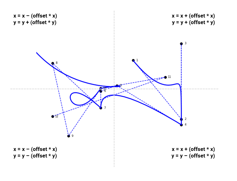
Say we have a data point where x = 0.8 and y = 1.6.
With an offset set to 0.1, it will change the x-value to 0.88, moving it further away from the middle value 0. The y value, as it is below the middle value, will turn into 1.44, also moving away from the middle value of the y-axis (=max y-value/2).
With an offset set to -0.1 (the opposite perspective), the x-value will change to 0.72, closing in on the middle. The y-value will change to 1.76, also closing in on the middle value.
The Unintended Results
When I generated the visuals with offsets, and combined them in a GIF animation, I did not get the 3D perspective result that I was looking for. Here’s an example with the perspective offset set to 0.1:

Does not really look 3D does it? I could have expected that. My visual is probably too clean to trick eyes into seeing a perspective. And second, I use Bezier curves to plot my lines. And as the data points change, those curves change quite dramatically as well. Not the overall change in perspective I was looking for. A better approach would probably be skewing the image of a plot.
But my GIF did make me wonder what it would look like if I generated more extreme offset frames. And since it’s all code, it’s easy to do just that. So I generated some more GIFs. One with 11 frames, one with 21 frames, and one with 40 frames.
Plot with 11 frames and an max offset of 0.5:

Plot with 21 frames and a maximum offset of 1.0 (which forces some data points all the way to the edge):

Plot with 41 frames and a maximum offset of 2.0 (flipping some data points):

Now this is pretty interesting, and does ‘catch my eye’. Although I’m not really sure why.
In my project, I use a computer algorithm and Bezier curves to visualise music with an organic abstract line. This animation has a kind of interesting motion to it. Almost as if the visual is breathing by trying out plots. Trying to find a ‘fit’.
This was not what I intended to make, but I like it. I’ll save a successful 3D wobble plot for another time.
Technical note: the visuals were generated using my Avicii Project (GitHub). I used the imageio package to generate the GIFs. If you want to know more about the technical details, feel free to reach out.