
Last year, I started running workshops based on my Avicii Open Data Art project. I sometimes add a new element to the workshop and it was one of these new elements that made me think of a new, more serious, application of abstract data visualisation. In this post, I’ll share the idea with you, and give an example of how it could work.
Comparing data through visualisation
With my data art project, I turn music lyrics into sentiment data using Google’s Natural Language API. Last year, I thought it would be fun to generate a similar dataset with the people taking the course. We could then compare the result with Google’s result. The main goal for me here was to show how different a Google algorithm is to a crowd’s opinion.
A beautiful little Pythons script allowed me to turn the crowd opinion on songs into a similar dataset that I get from the Google API. These are the normalised data:
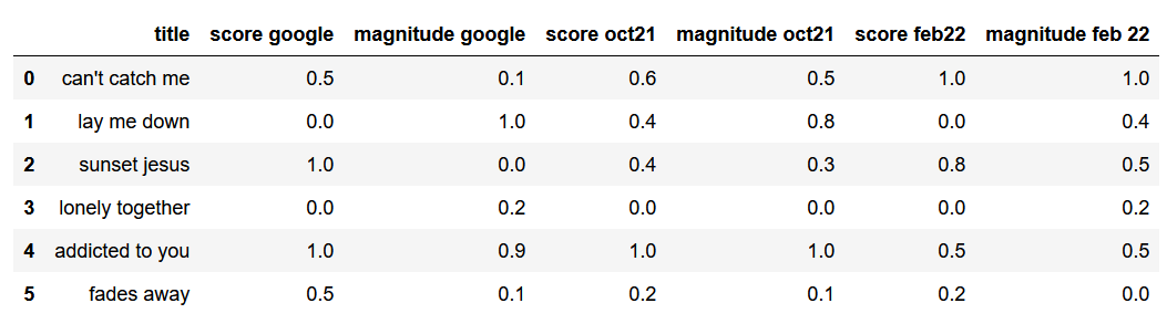
Now it’s interesting to look at the numbers and compare the differences, but it becomes way more apparent when you visualise the data. Using the score for x-coordinates, and the magnitude for y-coordinates, I can represent the data as polygons.
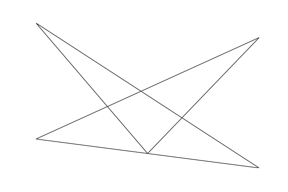
Here’s Google’s result on October 2021:
Here’s a result from a six-person-crowd on October 2021:

Here’s a result from a twenty-people-crowd on February 2022:

And here are the results combined:
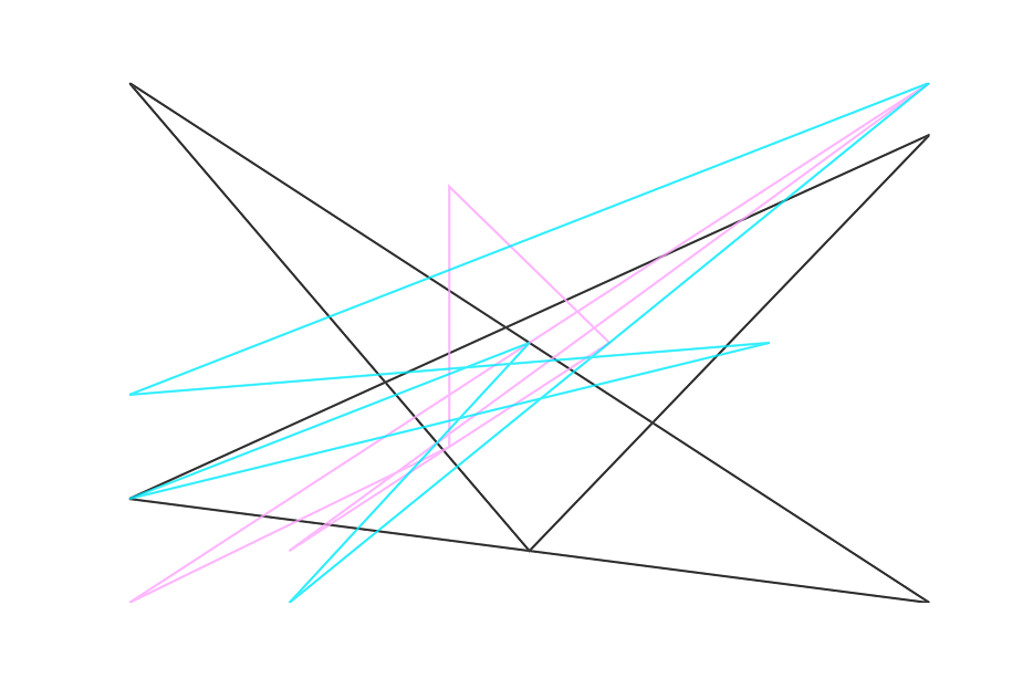
Pretty interesting right? You can clearly see that all three generate results that a clearly different.
Monitoring model changes over time
This made me wonder if I could use my abstract visualisations to monitor model changes over time. Over the past three years, I did notice changes to the results of Google’s Natural Language API. Let’s look at an example of the lyrics on Avicii’s TIM.
Here’s my original result from June 2019:

Here’s a new version based on the same lyrics from February 2022:
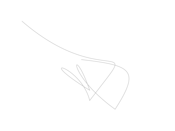
And a comparison image:
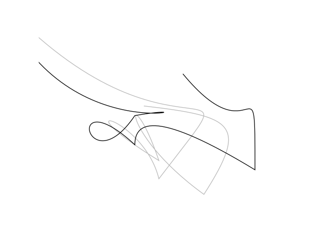
That is quite different right? I think some types of abstract visualisations can make it way easier for you to see if the output of a model has changed, and by how much.
Contemporary Data Art
What I also like about this new insight, is that it adds a new contemporary layer to my data art project. My original visualisation from June 2019 clearly contains a T-shape. That T-shape is now gone. (Avicii’s real name is Tim, which makes the T important.) So apparently it was a good idea to run the analysis that close to the release of the album TIM. If I would have run it at a later time, the results would have been different.
Lucky me.