
Earlier this year, I designed my own watch face for the Garmin smartwaches. I did so because of two reasons: 1) after browsing the existing watch faces, I didn’t find one that I liked; and 2) it forced me to build an app using a technology that’s new to me.
The result is a watch face design inspired by the book Snow Crash that displays time using a grid of binary indicators. It took a couple of weeks to get used to this new way of reading time. The grid I use to display time results in some interesting visual patterns. In this post, I want to share some of them.
Visualising time with a binary grid
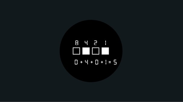
As a brief recap, let’s first have a look at the general design setup. The image below shows how a single line of binary indicators displays a number:
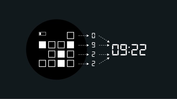
The design stacks four of these binary indicator bars on top of one another to display the four digits of time (hh:mm). Here’s an example of what 09:22 looks like with the design.
Depending on the time display settings of a user (this can be either set to 24h or am/pm) the design changes slightly. Let’s look at the time 10:11pm/22:11 using both types of settings:
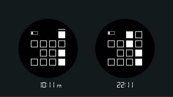
For the rest of this post, I use the am/pm version as that is the time setting I use myself.
Visual time patterns
As I already mentioned, it took me some time to get used to the way my design displays time. But after getting comfortable with it, I started to see interesting shapes in my design.
Below are some examples of these patterns. I tried to name each of them and (as I am also a science fiction fan and it’s fun) tried to dream up what these time patterns could mean in a world where my watch face design would be the default way to look at time.
It’s time to unite
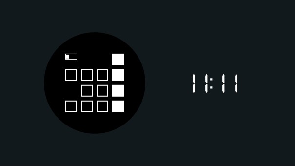
When it’s 11:11 the binary grid displays some sort of unity. It feels like all the squares are united on one side. Fantasising about the possible meaning of this time in a fictional world, it could be a moment during the day that we spent united. Either with friends or family, with colleagues during office hours or another group of people we feel are important to us.
A new middle of the day
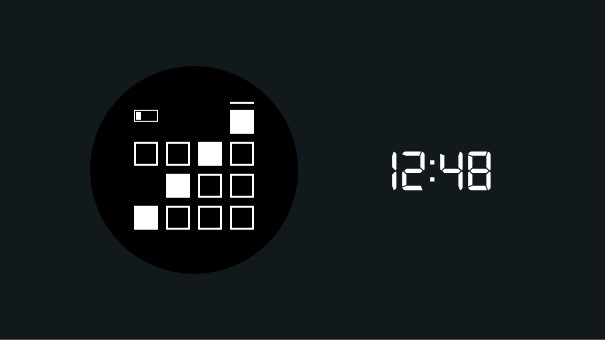
Ah yes, a new way to divide the day. For some reason, 12:00 feels like the time we use to cut a day in half. But this diagonal line made me think: it’s a bit weird to use 12:00 for that. Looking at the time we spend awake, assuming a sleeping schedule of 23:00 – 07:00, we spend about 5 awake in the morning and 11 in the afternoon and evening. Would it hurt our mornings if we chip away 48 minutes of its imaginary duration?
Open to opportunities
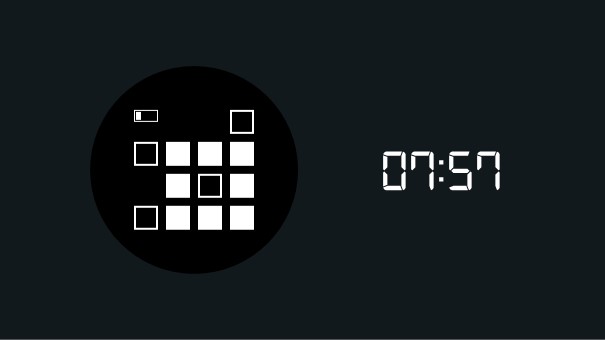
Most people in my fictional world start working or doing other important tasks at 07:57 am. It’s when the time shows the O of Opportunities of the new day. People rise and shine. People make sure to stop working on anything serious by 07:57 pm and focus on their leisure time.
Stop working o’clock
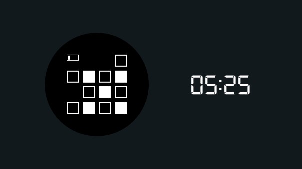
Where the O is the indication for the start of the day, the X is the closing moment of the day and the night. People don’t get up any earlier than 05:25 am and are legally required to stop working at 05:25 pm. The X o’clock and O o’clock work together in interesting ways. The time between X and O in the morning is used to get up, do things that are important to you, and after that get to work. In the evening, the order reverses. You end your working day by X o’clock, get home, work something important (but personal), and stop working on anything serious by O o’clock.
Unintended visual patterns
There are more interesting patterns in the design. I’ll leave those to the users to discover. When thinking about the design, I didn’t have these patterns in mind. But it’s nice to be able to build something and see these visually pleasing patterns emerge.
If you have a Garmin watch and what to give a go, you can download the design here (it’s free).