
I like reading books. And sometimes, a book triggers me to make a data visualisation. The First Fifteen Lives of Harry August is one of those books. Consider this post a small, visual, tribute to the book by Claire North
Warning: some spoilers for the book ahead.
The data visualisation idea
The book tells the story of Harry August, a person that reincarnates back to the start of his life every time he dies. After reading about a third of the story, I got the idea to visualise the fifteen lives described in the book.
The idea I have is to visualise the length of his lives.
Before I collect the data, I setup my code (python, matplotlib) and set up a first version of the data visualisation using a list of 15 randomly generated numbers.
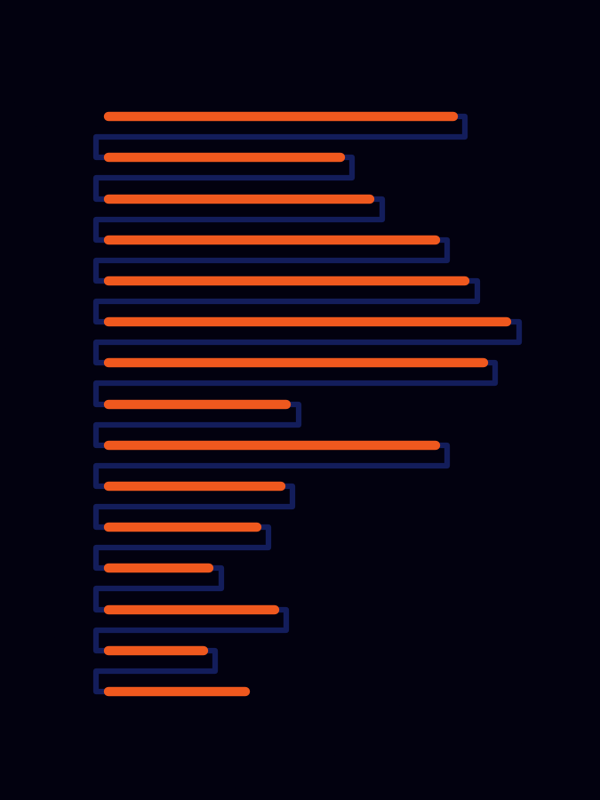
It shows the length of each life in red and the reincarnation to the next one in a dark colour.
The colours are inspired by the book cover.
The data collection
Alright, with the visualisation ready, it’s time to collect the data. I get out my notebook and start looking for relevant data. There are a few data points I want to look out for:
- The iteration a story takes place in (which life is it?)
- The age mentioned when Harry dies.
- The year mentioned when Harry dies.
- The year Harry is born. This helps me calculate his age.
Besides that, there is another interesting data point near the end: the cumulative age of all his lives combined. This turns up in his 14th life.
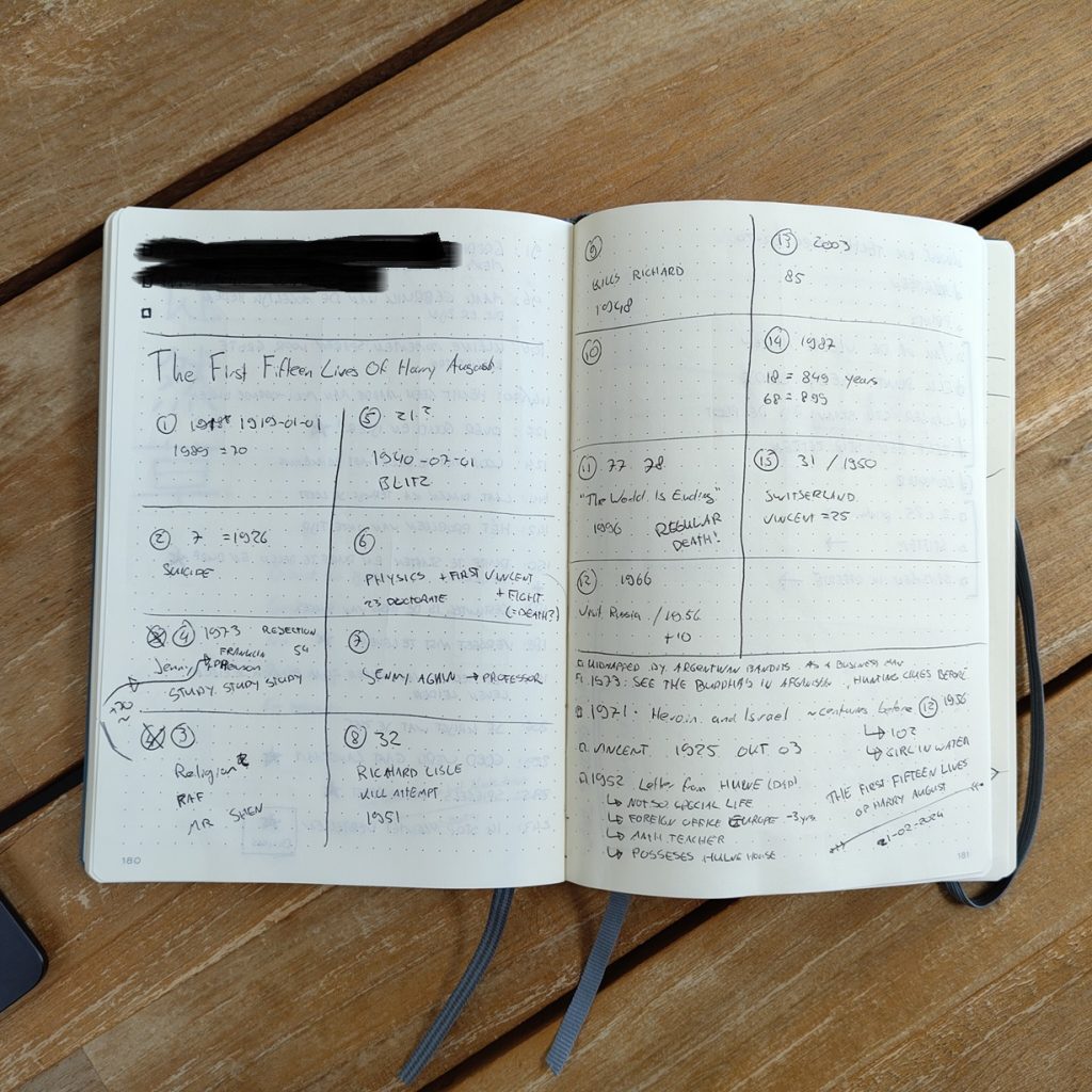
Here’s a picture of my data collection notes:
Caution: this image has some story elements, skip ahead to prevent spoilers.
After writing down all the data I found, I noticed something interesting: the list is incomplete. For some lives, he doesn’t share at what age he dies. But maybe, using the cumulative age of his 14th life, I can estimate the missing ones.
Using some basic maths, I estimated that the average age for the missing years should be ~77. This feels about right, because in his 13th life Harry mentions that reaching the new millennium is a rare event for him.
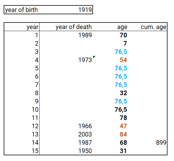
Some notes on this data:
- The black values are directly mentioned in the book. Sometimes I get the year Harry dies, sometimes his age, sometimes both, and just as often nothing.
- The red values are calculated using his year of birth.
- The blue ones are based on the cumulative age in his fourteenth life, subtracting al known ages from that, and dividing by the number of lives without an explicitly stated age.
Time to feed the real data into the python visualisation I set up.
Harry August’s lives visualised
The final visualisation is similar to the draft one, but with some small changes:
- Change the aspect ratio to match A-paper size (I like that, and makes it easy to print later).
- Use a lower intensity colour for the estimated ages. This area ranges from -5 to +5 years compared to the estimated age of ~77. The goal is to visualize some uncertainty here.
- It highlights the the 11th year, which is important to the story (you’ll read why early on in the book).
- Add a title.
- Use 15 a lot. For example, the margins of the plot is 15% on all sides, the x-axis range is 15, and the font size is set to 15.
You can view the end result below:
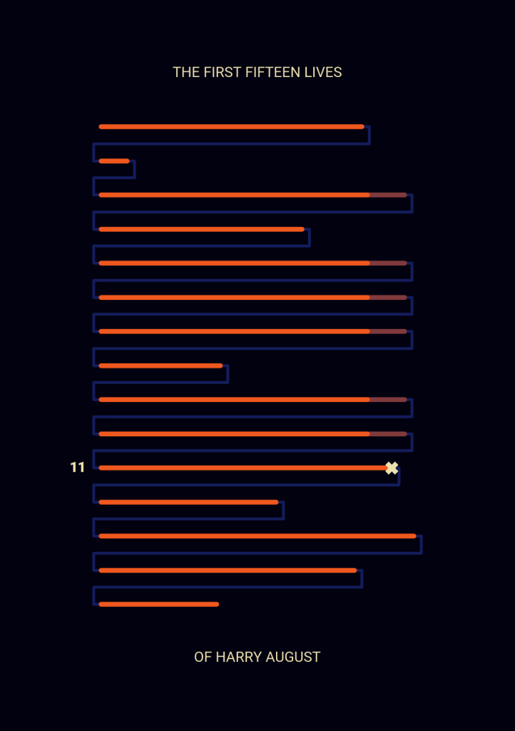
I’m quite happy with this data visualisation. I think it captures the lives of Harry August nicely, without really spoiling anything major. It’s something that could draw people in.
Maybe it could even be a book cover?
Perhaps.
A note on the technology
This visualisation was made using python and Matplotlib. Data collection and analysis was partly done by hand (pen & paper) and a little bit of Excel.